Update (Apr 2012): the exploratory work described in this post has since blossomed into the Overview Project, an open-source large document set visualization tool for investigative journalists and other curious people, and we’ve now completed several stories with this technique. If you’d like to apply this type of visualization to your own documents, give Overview a try!
Last month, my colleague Julian Burgess and I took a shot a peering into the Iraq War Logs by visualizing them in bulk, as opposed to using keyword searches in an attempt to figure out which of the 391,832 SIGACT reports we should be reading. Other people have created visualizations of this unique document set, such as plots of the incident locations on a map of Iraq, and graphs of monthly casualties. We wanted to go a step further, by designing a visualization based on the the richest part of each report: the free text summary, where a real human describes what happened, in jargon-inflected English.
Also, we wanted to investigate more general visualization techniques. At the Associated Press we get huge document dumps on a weekly or sometimes daily basis. It’s not unusual to get 10,000 pages from a FOIA request — emails, court records, meeting minutes, and many other types of documents, most of which don’t have latitude and longitude that can be plotted on a map. And all of us are increasingly flooded by large document sets released under government transparency initiatives. Such huge files are far too large to read, so they’re only as useful as our tools to access them. But how do you visualize a random bunch of documents?
We’ve found at least one technique that yields interesting results, a graph visualization where each document is node, and edges between them are weighted using cosine-similarity on TF-IDF vectors. I’ll explain exactly what that is and how to interpret it in a moment. But first, the journalism. We learned some things about the Iraq war. That’s one sense in which our experiment was a success; the other valuable lesson is that there are a boatload of research-grade visual analytics techniques just waiting to be applied to journalism.
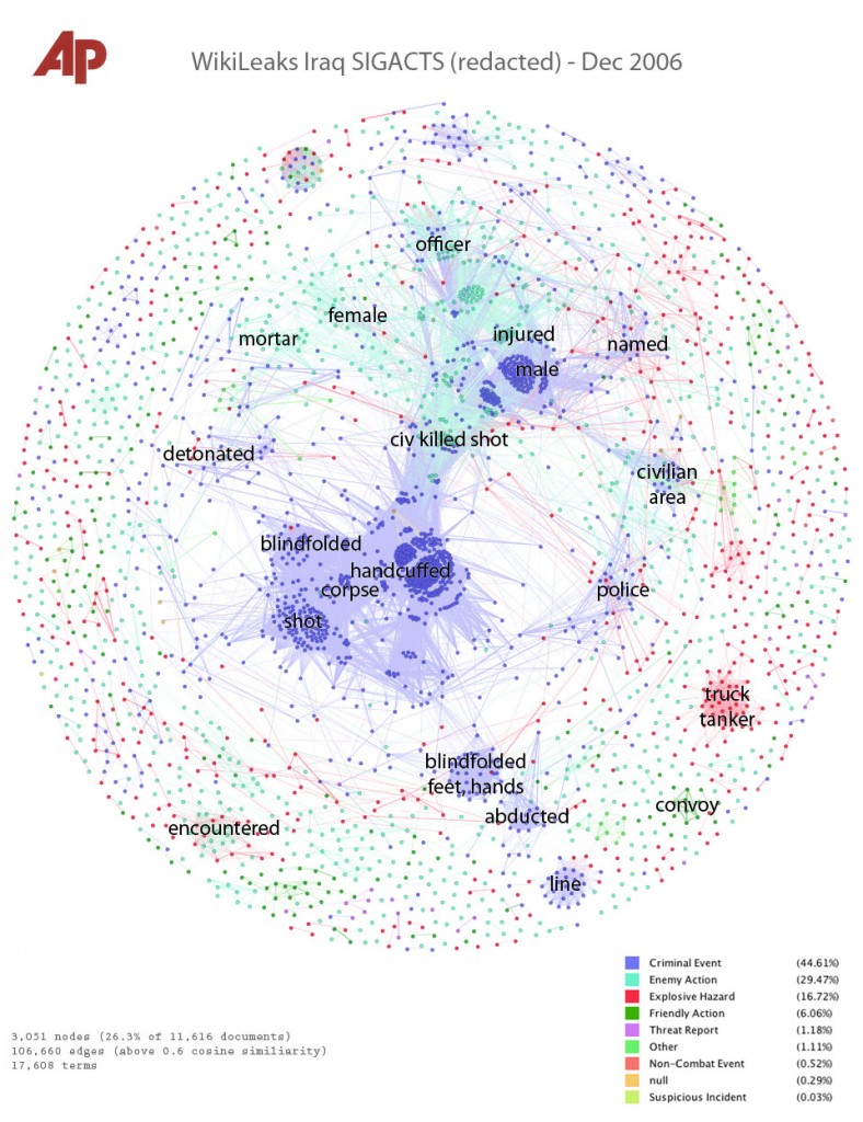
click for super hi-res version
Interpreting the Iraq War, December 2006
This is a picture of the 11,616 SIGACT (“significant action”) reports from December 2006, the bloodiest month of the war. Each report is a dot. Each dot is labelled by the three most “characteristic” words in that report. Documents that are “similar” have edges drawn between them. The location of the dot is abstract, and has nothing to do with geography. Instead, dots with edges between them are pulled closer together. This produces a series of clusters, which are labelled by the words that are most “characteristic” of the reports in that cluster. I’ll explain precisely what “similar” and “characteristic” mean later, but that’s the intuition.
Continue reading A full-text visualization of the Iraq War Logs

