Peace, Conflict, and Data

A talk I gave at the IPSI Bologna Symposium on conflict resolution. Slides here.

We might be able to do better at conflict resolution — making peace in violent conflicts — with the help of good data analysis. There have long been data sets about war and violent conflict at the state level, but we now have much more.

There are now extraordinarily detailed, open-source event data streams that can be used for violence prediction. Conflict “microdata” from social media and communications records can be used to visualize the divisions in society. I also suggest a long term program of conflict data collection to learn, over many cases, what works in conflict resolution and what doesn’t.

We’re really just at the beginning of all of this. There are huge issues around data collection, interpretation, privacy, security, and politics. But the potential is too great to ignore.

Update: two excellent resources have come to my attention in the days since I gave this talk (which is, of course, part of why I give talks.)

First, see the International Peace Institute’s paper on Big Data for Conflict Prevention. This paper was co-authored by Patrick Meier, who has been deeply involved in the crisis mapping work I mentioned in my talk.

But even more awesome, Erica Chenoweth has done exactly the sort of data-driven case-control study I was contemplating in my talk, and shown that non-violent political resistance succeeds twice as often as armed resistance. Her data set, the Nonviolent and Violent Campaigns and Outcomes (NAVCO) Data Project, also shows that non-violence is much more likely to lead to good democracies five years later, and that a movement that can recruit 10% of the population is almost guaranteed to succeed.

I highly recommend her talk.

What should the digital public sphere do?

Earlier this year, I discovered there wasn’t really a name for the thing I wanted to talk about. I wanted a word or phrase that includes journalism, social media, search engines, libraries, Wikipedia, and parts of academia, the idea of all these things as a system for knowledge and communication. But there is no such word. Nonetheless, this is an essay asking what all this stuff should do together.

What I see here is an ecosystem. There are narrow real-time feeds such as expertly curated Twitter accounts, and big general reference works like Wikipedia. There are armies of reporters working in their niches, but also colonies of computer scientists. There are curators both human and algorithmic. And I have no problem imagining that this ecosystem includes certain kinds of artists and artworks. Let’s say it includes all public acts and systems which come down to one person trying to tell another, “I didn’t just make this up. There’s something here of the world we share.”

I asked people what to call it. Some said “media.” That captures a lot of it, but I’m not really talking about the art or entertainment aspects of media. Also I wanted to include something of where ideas come from, something about discussions, collaborative investigation, and the generation of new knowledge. Other people said “information” but there is much more here than being informed. Information alone doesn’t make us care or act. It is part of, but only part of, what it means to connect to another human being at a distance.  Someone else said “the fourth estate” and this is much closer, because it pulls in all the ideas around civic participation and public discourse and speaking truth to power, loads of stuff we generally file under “democracy.” But the fourth estate today means “the press” and what I want to talk about is broader than journalism.

I’m just going to call this the “digital public sphere”, building on Jürgen Habermas’ idea of a place for the discussion of shared concerns, public yet apart from the state. Maybe that’s not a great name — it’s a bit dry for my taste — but perhaps it’s the best that can be done in three words, and it’s already in use as a phrase to refer to many of the sorts of things I want to talk about. “Public sphere” captures something important, something about the societal goals of the system, and “digital” is a modifier that means we have to account for interactivity, networks, and computation. Taking inspiration from Michael Schudson’s essay “Six or seven things that news can do for democracy,” I want to ask what the digital public sphere can do for us. I think I see three broad categories, which are also three goals to keep in mind as we build our institutions and systems.

1. Information. It should be possible for people to find things out, whatever they want to know. Our institutions should help people organize to produce valuable new knowledge. And important information should automatically reach each person at just the right moment.

2. Empathy. The vast majority of people in the world, we will only know through media. We must strive to represent the “other” to each-other with compassion and reality. We can’t forget that there are people on the other end of the wire.

3. Collective action. What good is public deliberation if we can’t eventually come to a decision and act? But truly enabling the formation of broad agreement also requires that our information systems support conflict resolution. In this age of complex overlapping communities, this role spans everything from the local to the global.

Each of these is its own rich area, and each of these roles already cuts across many different forms and institutions of media.

Information
I’d like to live in a world where it’s cheap and easy for anyone to satisfy the following desires:

  1. “I want to learn about X.”
  2. “How do we know that about X?”
  3. “What are the most interesting things we don’t know about X?”
  4. “Please keep me informed about X.”
  5. “I think we should know more about X.”
  6. “I know something about X and want to tell others.”

These desires span everything from mundane queries (“what time does the store close?”) to complex questions of fact (“what will be the effects of global climate change?”) And they apply at all scales; I might have a burning desire to know how the city government is going to deal with bike lanes, or I might be curious about the sum total of humanity’s knowledge of breast cancer — everything we know today, plus all the good questions we can’t yet answer. Different institutions exist to address each of these needs in various ways. Libraries have historically served the need to answer specific questions, desires number #1 and #2, but search engines also do this. Journalism strives to keep people abreast of current events, the essence of #4. Academia has focused on how we know and what we don’t yet know, which is #2 and #3.

This list includes two functions related to the production of new knowledge, because it seems to me that the public information ecosystem should support people working together to become collectively smarter. That’s why I’ve included #5, which is something like casting a vote for an unanswered question, and #6, the peer-to-peer ability to provide an answer. These seem like key elements in the democratic production of knowledge, because the resources which can be devoted to investigating answers are limited. There will always be a finite number of people well placed to answer any particular question, whether those people are researchers, reporters, subject matter experts, or simply well-informed. I like to imagine that their collective output is dwarfed by human curiosity. So efficiency matters, and we need to find ways to aggregate the questions of a community, and route each question to the person or people best positioned to find out the answer.

In the context of professional journalism, this amounts to asking what unanswered questions are most pressing to the community served by a newsroom. One could devise systems of asking the audience (like Quora and StackExchange) or analyze search logs (ala Demand Media.) That newsrooms don’t frequently do these things is, I think, an artifact of industrial history — and an unfilled niche in the current ecosystem. Search engines know where the gaps between supply and demand lie, but they’re not in the business of researching new answers. Newsrooms can produce the supply, but they don’t have an understanding of the demand. Today, these two sides of the industry do not work together to close this loop. Some symbiotic hybrid of Google and The Associated Press might be an uncannily good system for answering civic questions.

When new information does become available, there’s the issue of timing and routing. This is #4 again, “please keep me informed.” Traditionally, journalism has answered the question “who should know when?” with “everyone everything as fast as possible” but this is ridiculous today. I really don’t want my phone to vibrate for every news article ever written, which is why only “important” stories generate alerts. But taste and specialization dictate different definitions of “important” for each person, and old answers delivered when I need them might be just as valuable as new information delivered hot and fresh. Google is far down this track with its thinking on knowing what I want before I search for it.

Empathy 
There is no better way to show one person to another, across a distance, than the human story. These stories about other people may be informative, sure, but maybe their real purpose is to help us feel what it is like to be someone else. This is an old art; one journalist friend credits Homer with the last major innovation in the form.

But we also have to show whole groups to each other, a very “mass media” goal. If I’ve never met a Cambodian or hung out with a union organizer, I only know what I see in the media. How can and should entire communities, groups, cultures, races, interests or nations be represented?

A good journalist, anthropologist, or writer can live with a community for a while, observing and learning, then articulate generalizations. This is important and useful. It’s also wildly subjective. But then, so is empathy. Curation and amplification can also be empathetic processes: someone can direct attention to the genuine voices of a community. This “don’t speak, point” role has been articulated by Ethan Zuckerman and practiced by Andy Carvin.

But these are still at the level of individual stories. Who is representative? If I can only talk to five people, which five people should I know? Maybe a human story, no matter how effective, is just a single sample in the sense of a tiny part standing for the whole. Turning this notion around, making it personal, I come to an ideal: If I am to be seen as part of some group, then I want representations of that group to include me in some way. This is an argument that mass media coverage of a community should try to account for every person in that community. This is absurd in practical terms, but it can serve as a signpost, a core idea, something to aim for.

Fortunately, more inclusive representations are getting easier. Most profoundly, the widespread availability of peer-to-peer communication networks makes it easier than ever for a single member of a community to speak and be heard widely.

We also have data. We can compile the demographics of social movements, or conduct polls to find “public opinion.” We can learn a lot from the numbers that describe a particular population, which is why surveys and censuses persist. But data are terrible at producing the emotional response at the core of empathy. For most people, learning that 23% of the children in some state live in poverty lacks the gut-punch of a story about a child who goes hungry at the end of every month. In fact there is evidence that making someone think analytically about an issue actually makes them less compassionate.

The best reporting might combine human stories with broader data. I am impressed by CNN’s interactive exploration of American casualties in Iraq, which links mass visualization with photographs and stories about each individual. But that piece covers a comparatively small population, only a few thousand people. There are emerging techniques to understand much larger groups, such as by visualizing the data trails of online life, all of the personal information that we leave behind. We can visualize communities, using aggregate information to see the patterns of human association at all scales. I suspect that mass data visualization represents a fundamentally new way of understanding large groups, a way that is perhaps more inclusive than anecdotes yet richer than demographics. Also, visualization forces us into conversations about who exactly is a member of the community in question, because each person is either included in a particular visualization or not. Drawing such a hard boundary is often difficult, but it’s good to talk about the meanings of our labels.

And yet, for all this new technology, empathy remains a deeply human pursuit. Do we really want statistically unbiased samples of a community? My friend Quinn Norton says that journalism should “strive to show us our better selves.” Sometimes, what we need is brutal honesty. At other times, what we need is kindness and inspiration.

Collective action

What a difficult challenge advances in communication have become in recent decades. On the one hand they are definitely bringing us closer to each other, but are they really bringing us together?

– Ryszard Kapuściński, The Other

I am sensitive to the idea of filter bubbles and concerns about the fragmentation of media, the worry that the personalization of information will create a series of insular and homogenous communities, but I cannot abide the implied nostalgia for the broadcast era. I do not see how one-size-fits-all media can ever serve a diverse and specialized society, and so: let a million micro-cultures bloom! But I do see a need for powerful unifying forces within the public sphere, because everything from keeping a park clean to tackling global climate change requires the agreement and cooperation of a community.

We have long had decision making systems at all scales — from the neighborhood to the United Nations — and these mechanisms span a range from very lightweight and informal to global and ritualized. In many cases decision-making is built upon voting, with some majority required to pass, such as 51% or 66%. But is a vicious, hard-fought 51% in a polarized society really the best we can do? And what about all the issues that we will not be voting on — that is to say, most of them?

Unfortunately, getting agreement among even very moderate numbers of people seems phenomenally difficult. People disagree about methods, but in a pluralistic society they often disagree even more strongly about goals. Sometimes presenting all sides with credible information is enough, but strongly held disagreements usually cannot be resolved by shared facts; experimental work shows that, in many circumstances, polarization deepens with more information. This is the painful truth that blows a hole in ideas like “informed public” and “deliberative democracy.”

Something else is needed here. I want to bring the field of conflict resolution into the digital public sphere. As a named pursuit with its own literature and community, this is a young subject, really only begun after World War II. I love the field, but it’s in its infancy; I think it’s safe to say that we really don’t know very much about how to help groups with incompatible values find acceptable common solutions. We know even less about how to do this in an online setting.

But we can say for sure that “moderator” is an important role in the digital public sphere. This is old-school internet culture, dating back to the pre-web Usenet days, and we have evolved very many tools for keeping online discussions well-ordered, from classic comment moderation to collaborative filtering, reputation systems, online polls, and various other tricks. At the edges, moderation turns into conflict resolution, and there are tools for this too. I’m particularly intrigued by visualizations that show where a community agrees or disagrees along multiple axes, because the conceptually similar process of “peace polls” has had some success in real-world conflict situations such as Northern Ireland. I bet we could also learn from the arduously evolved dispute resolution processes of Wikipedia.

It seems to me that the ideal of legitimate community decision making is consensus, 100% agreement. This is very difficult, another unreachable goal, but we could define a scale from 51% agreement to 100%, and say that the goal is  “as consensus as possible” decision making, which would also be “as legitimate as possible.” With this sort of metric — and always remembering that the goal is to reach a decision on a collective action, not to make people agree for the sake of it — we could undertake a systematic study of online consensus formation. For any given community, for any given issue, how fragmented is the discourse? Do people with different opinions hang out in different places online? Can we document examples of successful and unsuccessful online consensus formation, as has been done in the offline case? What role do human moderators play, and how can well-designed social software contribute? How do the processes of online agreement and disagreement play out at different scales and under different circumstances? How we do know when the process has converged to a “good” answer, and when it has degraded into hegemony or groupthink? These are mostly unexplored questions. Fortunately, there’s a huge amount of related work to draw on: voting systems and public choice theory, social network analysis, cognitive psychology, information flow and media ecosystems, social software design, issues of identity and culture, language and semiotics, epistemology…

I would like conflict resolution to be an explicit goal of our media platforms and processes, because we cannot afford to be polarized and grid-locked while there are important collective problems to be solved. We may have lost the unifying narrative of the front page, but that narrative was neither comprehensive nor inclusive: it didn’t always address the problems of concern to me, nor did it ask me what I thought. Effective collective action, at all relevant scales, seems a better and more concrete goal than “shared narrative.” It is also an exceptionally hard problem — in some ways it is the problem of democracy itself — but there’s lots to try, and our public sphere must be designed to support this.

Why now?
I began writing this essay because I wanted to say something very simple: all of these things — journalism, search engines, Wikipedia, social media and the lot — have to work together to common ends. There is today no one profession which encompasses the entirety of the public sphere. Journalism used to be the primary bearer of these responsibilities — or perhaps that was a well-meaning illusion sprung from near monopolies on mass information distribution channels. Either way, that era is now approaching two decades gone. Now what we have is an ecosystem, and in true networked fashion there may not ever again be a central authority. From algorithm designers to dedicated curators to, yes, traditional on-the-scene pro journalists, a great many people in different fields now have a part in shaping the digital public sphere. I wanted try to understand what all of us are working toward. I hope that I have at least articulated goals that we can agree are important.
 

Visualizing communities

There are in fact no masses; there are only ways of seeing people as masses.
Raymond Williams

Who are the masses that the “mass media” speaks to? What can it mean to ask what “teachers” or “blacks” or “the people” of a country think? These words are all fiction, a shorthand which covers over our inability to understand large groups of unique individuals. Real people don’t move in homogeneous herds, nor can any one person be neatly assigned to a single category. Someone might view themselves simultaneously as the inhabitant of a town, a new parent, and an active amateur astronomer. Now multiply this by a million, and imagine trying to describe the overlapping patchwork of beliefs and allegiances.

But patterns of association leave digital traces. Blogs link to each other, we have “friends” and “followers” and “circles,” we share interesting tidbits on social networks, we write emails, and we read or buy things. We can visualize this data, and each type of visualization gives us a different answer to the question “what is a community?” This is different from the other ways we know how to describe groups. Anecdotes are tiny slices of life that may or may not be representative of the whole, while statistics are often so general as to obscure important distinctions. Visualizations are unique in being both universal and granular: they have detail at all levels, from the broadest patterns right down to individuals. Large scale visualizations of the commonalities between people are, potentially, a new way to represent and understand the public — that is, ourselves.

I’m going to go through the major types of community visualizations that I’ve seen, and then talk about what I’d like to do with them. Like most powerful technologies, large scale visualization is a capability that can also be used to oppress and to sell. But I imagine social ends, worthwhile ways of using visualization to understand the “public” not as we imagine it, but as something closer to how we really exist.

Continue reading Visualizing communities

A job posting that really doesn’t suck

I just got a pile of money to build a piece of state-of-the-art open-source visualization software, to allow journalists and curious people everywhere to make sense of enormous document dumps, leaked or otherwise.

Huzzah!

Now I am looking for a pair of professional developers to make it a reality. It won’t be hard for the calibre of person I’m trying to find to get some job, but I’m going to try to convince you that this is the best job.

The project is called Overview. You can read about it at overview.ap.org. It’s going to be a system for the exploration of large to very large collections of unstructured text documents. We’re building it in New York in the main newsroom of The Associated Press, the original all-formats global news network. The AP has to deal with document dumps constantly. We download them from government sites. We file over 1000 freedom of information requests each year. We look at every single leak from Wikileaks, Anonymous, Lulzsec. We’re drowning in this stuff. We need better tools. So does everyone else.

So we’re going make the killer app for document set analysis. Overview will start with a visual programming language for computational linguistics algorithms. Like Max/MSP for text. The output of that will be connected to some large-scale visualization. All of this will be backed by a distributed file store and computed through map-reduce. Our target document set size is 10 million. The goal is to design a sort of visualization sketching system for large unstructured text document sets. Kinda like Processing, maybe, but data-flow instead of procedural.

We’ve already got a prototype working, which we pointed at the Wikileaks Iraq and Afghanistan data sets and learned some interesting things. Now we have to engineer an industrial-strength open-source product. It’s a challenging project, because it requires production implementation of state-of-the-art, research-level algorithms for distributed computing, statistical natural language processing, and high-throughput visualization. And, oh yeah, a web interface. So people can use it anywhere, to understand their world.

Because that’s what this is about: a step in the direction of applied transparency. Journalists badly need this tool. But everyone else needs it too. Transparency is not an end in itself — it’s what you can do with the data that counts. And right now, we suck at making sense of piles of documents. Have you ever looked at what comes back from a FOIA request? It’s not pretty. Governments have to give you the documents, but they don’t have to organize them. What you typically get is a 10,000 page PDF. Emails mixed in with meeting minutes and financial statements and god-knows what else. It’s like being let into a decrepit warehouse with paper stacked floor to ceiling. No boxes. No files. Good luck, kiddo.

Intelligence agencies have the necessary technology, but you can’t have it. The legal profession has some pretty good “e-discovery” software, but it’s wildly expensive. Law enforcement won’t share either. There are a few cheapish commercial products but they all choke above 10,000 documents because they’re not written with scalable, distributed algorithms. (Ask me how I know.) There simply isn’t an open, extensible tool for making sense of huge quantities of unstructured text. Not searching it, but finding the patterns you didn’t know you were looking for. The big picture. The Overview.

So we’re making one. Here are the buzzwords we are looking for in potential hires:

  • We’re writing this in Java or maybe Scala. Plus JavaScript/WebGL on the client side.
  • Be a genuine computer scientist, or at least be able to act like one. Know the technologies above, and know your math.
  • But it’s not just research. We have to ship production software. So be someone who has done that, on a big project.
  • This stuff is complicated! The UX has to make it simple for the user. Design, design, design!
  • We’re open-source. I know you’re cool with that, but are you good at leading a distributed development community?

And that’s pretty much it. We’re hiring immediately. We need two. It’s a two-year contract to start. We’ve got a pair of desks in the newsroom in New York, with really nice views of the Hudson river. Yeah, you could write high-frequency trading software for a hedge fund. Or you could spend your time analyzing consumer data and trying to get people to click on ads. You could code any of a thousand other sophisticated projects. But I bet you’d rather work on Overview, because what we’re making has never been done before. And it will make the world a better place.

For more information, see :

Thanks for your time. Please contact jstray@ap.org if you’d like to work on this.

Investigating thousands (or millions) of documents by visualizing clusters

This is a recording of my talk at the NICAR (National Institute of Computer-Assisted Reporting) conference last week, where I discuss some of our recent work at the AP with the Iraq and Afghanistan war logs.

References cited in the talk:

  • “A full-text visualization of the Iraq war logs”, a detailed writeup of the technique used to generate the first set of maps presented in the talk.
  • The Glimmer high-performance, parallel multi-dimensional scaling algorithm, which is the software I presented in the live demo portion. It will be the basis of our clustering work going forward. (We are also working on other large-scale visualizations which may be more appropriate for e.g. email dumps.)
  • “Quantitative Discovery from Qualitative Information: A General-Purpose Document Clustering Methodology.” Justin Grimmer, Gary King, 2009. A paper that everyone working in document clustering needs to read. It clearly makes the point that there is no “best” clustering, just different algorithms that correspond to different pre-conceived frames on the story — and gives a method to compare clusterings (though I don’t think it will scale well to millions of docs.)
  • Wikipedia pages for bag of words model, tf-idf, and cosine similarity, the basic text processing techniques we’re using.
  • Gephi, a free graph visualization system, which we used for the one-month Iraq map. It will work up to a few tens of thousands of nodes.
  • Knight News Challenge application for “Overview,” the open-source system we’d like to build for doing this and other kinds of visual explorations of large document sets. If you like our work, why not leave a comment on our proposal?

The state of The State of the Union coverage, online

The state of the union is a big pre-planned event, so it’s a great place to showcase new approaches and techniques. What do news digital news organizations do when they go all out? Here’s my roundup of online coverage Tuesday night.

Live coverage

The Huffington Post, the New York Times, the Wall Street JournalABCCNNMashable, and many others, including even Mother Jones had live web video. But you can get live video on television, so perhaps the digitally native form of the live blog is more interesting. This can include commentary from multiple reporters, reactions from social media, link round-ups, etc. The New York Times, the Boston Globe, The Wall Street JournalCNNMSNBC, and many others had a live blog. The Huffington Post’s effort was particularly comprehensive, continuing well into Wednesday afternoon.

Multi-format, socially-aware live coverage is now standard, and by my reckoning makes television look meagre. But the experience is not really available on tablet and mobile yet. For example, almost all of the live video feeds were in Flash and therefore unavailable on Apple devices, as CNET reports.

As far as tools, there was some use of Coveritlive, but most live blogs seemed to be using nondescript custom software.

Visualizations

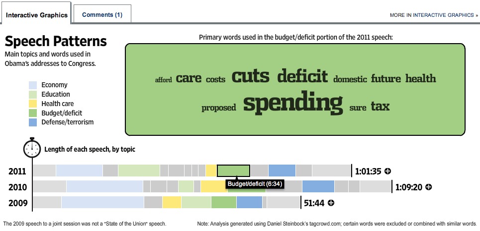
Lots of visualization love this year. But visualizations take time to create, so most of them were rooted in previously available SOTU information. The Wall Street Journal did an interactive topic and keyword breakdown of Obama’s addresses to congress since 2009, which moved about an hour after Tuesday’s speech concluded.

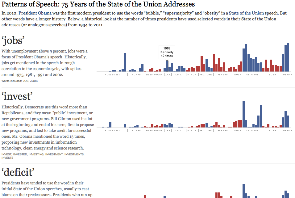
The New York Times had a snazzy graphic comparing the topics of 75 years of SOTU addresses,  by looking at the rates of certain carefully chosen words. Rollovers for individual counts, but mostly a flat thing.

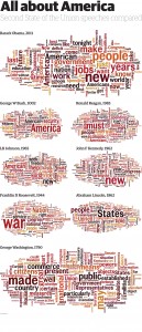
The Guardian Data Blog took a similar historical approach, with Wordles for SOTU speeches from Obama and seven other presidents back to Washington. Being the Data Blog, they also put the word frequencies for these speeches into a downloadable spreadsheet. It’s a huge image, definitely intended for big print pages.

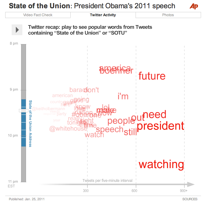
A shout-out to my AP colleagues for all their hard work on our SOTU interactive, which included the video, a fact-checked transcript, and an animated visualization of Twitter responses before, during, and after the State of the Union.

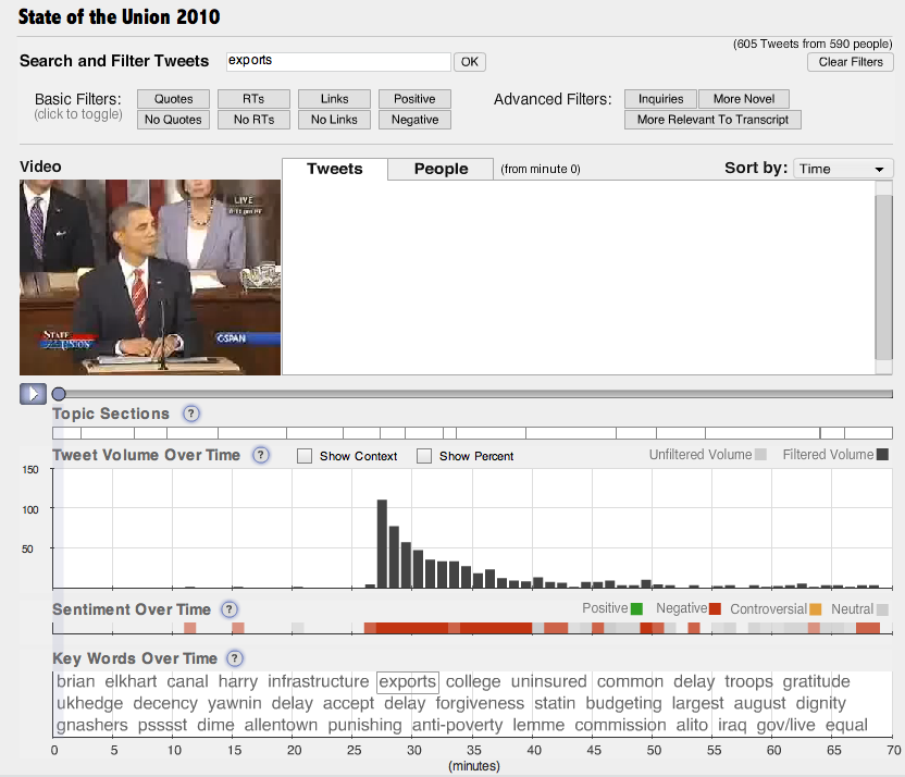
But it’s not clear what, if anything, we can actually learn from such visualizations. In terms of solid journalism content, possibly the best visualization came not from a news organization but from Nick Diakopoulos and co. at Rutgers University. Their Vox Civitas tool does filtering, search, and visualization of over  100,000 tweets captured during the address.

I find this interface a little too complex for general audience consumption — definitely a power user’s tool. But the algorithms are second to none. For example, Vox Civitas compares tweets to the text of the speech within the previous two minutes to detect “relevance,” and the automated keyword extraction — you can see the keywords at the bottom of the interface above — is based on tf-idf and seems to choose really interesting and relevant words. The interactive graph of keyword frequency over time clearly shows the sort of information that I had hoped to reveal with the AP’s visualization.

Fact Checking

A number of organizations did real-time or near real-time fact checking, as Yahoo reports. The Sunlight Foundation used itsSunlight Live system fo real-time fact checks and commentary. This platform, incorporating live video, social media monitoring, and other components is expected to be available as an open-source web app, for the use of other news organizations, by mid-2011.

The Associated Press published a long fact check piece (also integrated into the AP interactive), ABC had their own story, and CNN took a stab at it.

But the heaviest hitter was Politifact, who had a number of fact check rulings within hours and several more by Wednesday evening. These are together in a nice summary article, but as is their custom the individual fact checks are extensively documented and linked to primary sources.

Audience engagement

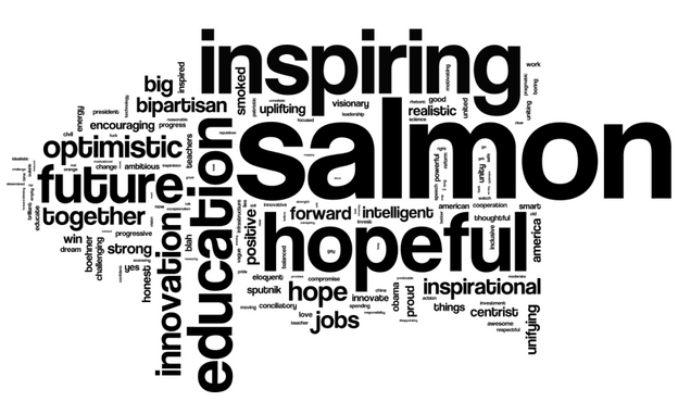
Pretty much every news organization had some SUTO action on social media, though with varying degrees of aggressiveness and creativity. Some of the more interesting efforts involved solicitation of audience responses of a specific kind. NPR asked people to describe their reaction to the state of the union in three words. This was promoted aggressively on Twitter and Facebook. They also asked for political affiliation, and split out the 4000 responses into Democratic and Republican word clouds:

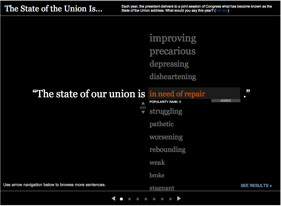
Apparently, Obama’s salmon joke went down well. The Wall Street Journal went live Tuesday morning with “The State of the Union is…” asking viewers to leave a one word answer. This was also promoted on Twitter. Their results were presented in the same interactive, as a popularity-sorted list.

Aside from this type of interactive, we saw lots of agressive social media engagement in general. The more social-media savvy organizations were all over this, promoting their upcoming coverage and responding to their audiences. As usual, the Huffington Post was pretty seriously tweeting the event, posting about updates to their live blog, etc. and going well into Wednesday morning. Perhaps inspired by NPR, they encouraged people to tweet their #3wordreaction to the speech. They also collected and highlighted reaction from teachers, Sarah Palin, etc.

But as an AP colleague of mine asked, engagement to what end? Getting people’s attention is great, but then how do we, as journalists, focus that attention in a way that makes people think or act?

The White House

No online media roundup of the SOTU would be complete without a discussion of the White House’s own efforts, including web and mobile app presences. Fortunately, Nieman Journalism Lab has done this for us. Here I’ll just add that the White House livestreamed a Q&A session in front of  an audience immediately after the speech, in which White House Office of Public Engagement’s Kal Penn (aka Kumar) read questions from social media. Then Obama himself did an intervew Thursday afternoon in which he answered questions submitted as videos on YouTube.

A full-text visualization of the Iraq War Logs

Update (Apr 2012): the exploratory work described in this post has since blossomed into the Overview Project, an open-source large document set visualization tool for investigative journalists and other curious people, and we’ve now completed several stories with this technique. If you’d like to apply this type of visualization to your own documents, give Overview a try!

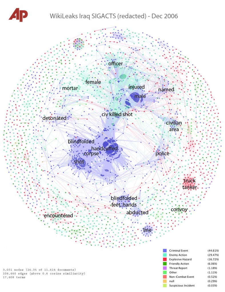
Last month, my colleague Julian Burgess and I took a shot a peering into the Iraq War Logs by visualizing them in bulk, as opposed to using keyword searches in an attempt to figure out which of the 391,832 SIGACT reports we should be reading. Other people have created visualizations of this unique document set, such as plots of the incident locations on a map of Iraq, and graphs of monthly casualties. We wanted to go a step further, by designing a visualization based on the the richest part of each report: the free text summary, where a real human describes what happened, in jargon-inflected English.

Also, we wanted to investigate more general visualization techniques. At the Associated Press we get huge document dumps on a weekly or sometimes daily basis. It’s not unusual to get 10,000 pages from a FOIA request — emails, court records, meeting minutes, and many other types of documents, most of which don’t have latitude and longitude that can be plotted on a map. And all of us are increasingly flooded by large document sets released under government transparency initiatives. Such huge files are far too large to read, so they’re only as useful as our tools to access them. But how do you visualize a random bunch of documents?

We’ve found at least one technique that yields interesting results, a graph visualization where each document is node, and edges between them are weighted using cosine-similarity on TF-IDF vectors. I’ll explain exactly what that is and how to interpret it in a moment. But first, the journalism. We learned some things about the Iraq war. That’s one sense in which our experiment was a success; the other valuable lesson is that there are a boatload of research-grade visual analytics techniques just waiting to be applied to journalism.

click for super hi-res version

Interpreting the Iraq War, December 2006
This is a picture of the 11,616 SIGACT (“significant action”) reports from December 2006, the bloodiest month of the war. Each report is a dot. Each dot is labelled by the three most “characteristic” words in that report. Documents that are “similar” have edges drawn between them. The location of the dot is abstract, and has nothing to do with geography. Instead, dots with edges between them are pulled closer together. This produces a series of clusters, which are labelled by the words that are most “characteristic” of the reports in that cluster. I’ll explain precisely what “similar” and “characteristic” mean later, but that’s the intuition.

Continue reading A full-text visualization of the Iraq War Logs