[Last updated: 18 April 2011 — added statistical NLP book link]
There is something extraordinarily rich in the intersection of computer science and journalism. It feels like there’s a nascent field in the making, tied to the rise of the internet. The last few years have seen calls for a new class of “programmer journalist” and the birth of a community of hacks and hackers. Meanwhile, several schools are now offering joint degrees. But we’ll need more than competent programmers in newsrooms. What are the key problems of computational journalism? What other fields can we draw upon for ideas and theory? For that matter, what is it?
I’d like to propose a working definition of computational journalism as the application of computer science to the problems of public information, knowledge, and belief, by practitioners who see their mission as outside of both commerce and government. This includes the journalistic mainstay of “reporting” — because information not published is information not known — but my definition is intentionally much broader than that. To succeed, this young discipline will need to draw heavily from social science, computer science, public communications, cognitive psychology and other fields, as well as the traditional values and practices of the journalism profession.
“Computational journalism” has no textbooks yet. In fact the term barely is barely recognized. The phrase seems to have emerged at Georgia Tech in 2006 or 2007. Nonetheless I feel like there are already important topics and key references.
Data journalism
Data journalism is obtaining, reporting on, curating and publishing data in the public interest. The practice is often more about spreadsheets than algorithms, so I’ll suggest that not all data journalism is “computational,” in the same way that a novel written on a word processor isn’t “computational.” But data journalism is interesting and important and dovetails with computational journalism in many ways.
- The Nieman Journalism Lab’s interview with Guardian Data Blog editor Simon Rogers remains a solid introduction to (one kind of) contemporary practice.
- The best practical guides I know are Rogers’ “How to: get to grips with data journalism” and Dan Nguyen’s series of data-scraping tutorials at ProPublica.
- Stanford’s Journalism in the Age of Data is an hour-long documentary on data journalism and visualization.
- The web is a linked system of human-readable documents. Now Tim Berners-Lee wants to create a web of machine-readable linked data. The full potential is unclear, but it’s a big idea that may come to be the backbone of semantic web visions. The New York Times, The Guardian, and others are experimenting with open data APIs.
- Everyblock creator Adrian Holovaty seems to have been the first to suggest that reporters file structured data in his 2006 “A Fundamental Way Newspaper Websites Need to Change.” This idea is beautifully expanded in Stijn Debrouwere’s “Information Architecture for News Websites” series.
Visualization
Big data requires powerful exploration and storytelling tools, and increasingly that means visualization. But there’s good visualization and bad visualization, and the field has advanced tremendously since Tufte wrote The Visual Display of Quantitative Information. There is lots of good science that is too little known, and many open problems here.
- Tamara Munzner’s chapter on visualization is the essential primer. She puts visualization on rigorous perceptual footing, and discusses all the major categories of practice. Absolutely required reading for anyone who works with pictures of data.
- Ben Fry invented the Processing language and wrote his PhD thesis on “computational information design,” which is his powerful conception of the iterative, interactive practice of designing useful visualizations.
- How do we make visualization statistically rigorous? How do we know we’re not just fooling ourselves when we see patterns in the pixels? This amazing paper by Wickham et. al. has some answers.
- Is a visualization a story? Segal and Heer explore this question in “Narrative Visualization: Telling Stories with Data.”
Computational linguistics
Data is more than numbers. Given that the web is designed to be read by humans, it makes heavy use of human language. And then there are all the world’s books, and the archival recordings of millions of speeches and interviews. Computers are slowly getting better at dealing with language.
- Word frequency techniques like tf-idf and the vector space document model are very simple and very useful. See also stemming. Lots more in the wonderful (and free!) Introduction to Information Retrieval. This book explains how search engines are built, and discusses tf-idf etc. in great technical detail.
- Statistical language models are increasingly important for all kinds of applications. Michael Nielsen has a great introduction to statistical machine translation. Google’s Peter Norvig discusses how he implemented statistical spelling correction on his laptop during a long plane flight. For the full deal, see the book Foundations of Statistical Natural Language Processing.
- On a related note, Google N-gram viewer lets you look at the frequency of short phrases within 4% of all books published, ever. The excellent paper gives examples of how to use this for cultural research. Dan Cohen has important criticisms.
- Speech-to-text algorithms enable automated transcription, and Matt Thompson explores the huge implications for journalism.
- Reuters maintains the OpenCalais entity extraction service, which parses text to contextually determine who and what is referenced.
- IBM’s Watson project built a question-answering system that reads reference books and wins at Jeopardy. Imagine how useful to journalists and curious readers this could be! This paper on the DeepQA system describes how they did it.
Communications technology and free speech
Code is law. Because our communications systems use software, the underlying mathematics of communication lead to staggering political consequences — including whether or not it is possible for governments to verify online identity or remove things from the internet. The key topics here are networks, cryptography, and information theory.
- The Handbook of Applied Cryptography is a classic, and free online. But despite the title it doesn’t really explain how crypto is used in the real world, like Wikipedia does.
- It’s important to know how the internet routes information, using TCP/IP and BGP, or at a somewhat higher level, things like the BitTorrent protocol. The technical details determine how hard it is to do things like block websites, suppress the dissemination of a file, or remove entire countries from the internet.
- Anonymity is deeply important to online free speech, and very hard. The Tor project is the outstanding leader in anonymity-related research.
- Information theory is stunningly useful across almost every technical discipline. Pierce’s short textbook is the classic introduction, while Tom Schneider’s Information Theory Primer seems to be the best free online reference.
Tracking the spread of information (and misinformation)
What do we know about how information spreads through society? Very little. But one nice side effect of our increasingly digital public sphere is the ability to track such things, at least in principle.
- Memetracker was (AFAIK) the first credible demonstration of whole-web information tracking, following quoted soundbites through blogs and mainstream news sites and everything in between. Zach Seward has cogent reflections on their findings.
- The Truthy Project aims for automated detection of astro-turfing on Twitter. They specialize in covert political messaging, or as I like to call it, computational propaganda.
- We badly need tools to help us determine the source of any given online “fact.” There are many existing techniques that could be applied to the problem, as I discussed in a previous post.
- If we had information provenance tools that worked across a spectrum of media outlets and feed types (web, social media, etc.) it would be much cheaper to do the sort of information ecosystem studies that Pew and others occasionally undertake. This would lead to a much better understanding of who does original reporting.
Filtering and recommendation
With vastly more information than ever before available to us, attention becomes the scarcest resource. Algorithms are an essential tool in filtering the flood of information that reaches each person. (Social media networks also act as filters.)
- The paper on preference networks by Turyen et. al. is probably as good an introduction as anything to the state of the art in recommendation engines, those algorithms that tell you what articles you might like to read or what movies you might like to watch.
- Before Google News there was Columbia News Blaster, which incorporated a number of interesting algorithms such as multi-lingual article clustering, automatic summarization, and more as described in this paper by McKeown et. al.
- Anyone playing with clustering algorithms needs to have a deep appreciation of the ugly duckling theorem, which says that there is no categorization without preconceptions. King and Grimmer explore this with their technique for visualizing the space of clusterings.
- Any digital journalism product which involves the audience to any degree — that should be all digital journalism products — is a piece of social software, well defined by Clay Shirky in his classic essay, “A Group Is Its Own Worst Enemy.” It’s also a “collective knowledge system” as articulated by Chris Dixon.
Measuring public knowledge
If journalism is about “informing the public” then we must consider what happens to stories after publication — this is the “last mile” problem in journalism. There is almost none of this happening in professional journalism today, aside from basic traffic analytics. The key question here is, how does journalism change ideas and action? Can we apply computers to help answer this question empirically?
- World Public Opinion’s recent survey of misinformation among American voters solves this problem in the classic way, by doing a randomly sampled opinion poll. I discuss their bleak results here.
- Blogosphere maps and other kinds of visualizations can help us understand the public information ecosystem, such as this interactive visualization of Iranian blogs. I have previously suggested using such maps as a navigation tool that might broaden our information horizons.
- UN Global Pulse is a serious attempt to create a real-time global monitoring system to detect humanitarian threats in crisis situations. They plan to do this by mining the “data exhaust” of entire societies — social media postings, online records, news reports, and whatever else they can get their hands on. Sounds like key technology for journalism.
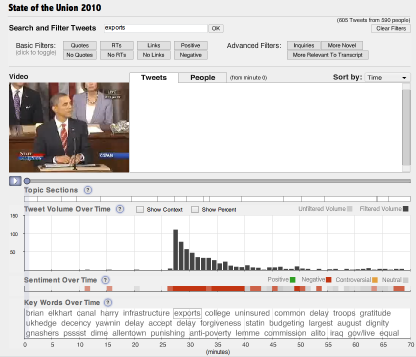
- Vox Civitas is an ambitious social media mining tool designed for journalists. Computational linguistics, visualization, and more.
Research agenda
I know of only one work which proposes a research agenda for computational journalism.
- “Computational Journalism: A Call to Arms for Database Researchers” by Sarah Cohen et. al. raises the very intriguing possibility of building systems that automatically or semi-automatically scan databases for stories, document the rationale for believing certain facts, etc.
This paper presents a broad vision and is really a must-read. However, it deals almost exclusively with reporting, that is, finding new knowledge and making it public. I’d like to suggest that the following unsolved problems are also important:
- Tracing the source of any particular “fact” found online, and generally tracking the spread and mutation of information.
- Cheap metrics for the state of the public information ecosystem. How accurate is the web? How accurate is a particular source?
- Techniques for mapping public knowledge. What is it that people actually know and believe? How polarized is a population? What is under-reported? What is well reported but poorly appreciated?
- Information routing and timing: how can we route each story to the set of people who might be most concerned about it, or best in a position to act, at the moment when it will be most relevant to them?
This sort of attention to the health of the public information ecosystem as a whole, beyond just the traditional surfacing of new stories, seems essential to the project of making journalism work.
