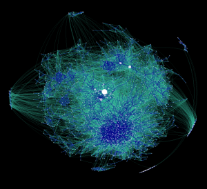
A full-text visualization of the Iraq War Logs

Update (Apr 2012): the exploratory work described in this post has since blossomed into the Overview Project, an open-source large document set visualization tool for investigative journalists and other curious people, and we’ve now completed several stories with this technique. If you’d like to apply this type of visualization to your own documents, give Overview a try!

Last month, my colleague Julian Burgess and I took a shot a peering into the Iraq War Logs by visualizing them in bulk, as opposed to using keyword searches in an attempt to figure out which of the 391,832 SIGACT reports we should be reading. Other people have created visualizations of this unique document set, such as plots of the incident locations on a map of Iraq, and graphs of monthly casualties. We wanted to go a step further, by designing a visualization based on the the richest part of each report: the free text summary, where a real human describes what happened, in jargon-inflected English.

Also, we wanted to investigate more general visualization techniques. At the Associated Press we get huge document dumps on a weekly or sometimes daily basis. It’s not unusual to get 10,000 pages from a FOIA request — emails, court records, meeting minutes, and many other types of documents, most of which don’t have latitude and longitude that can be plotted on a map. And all of us are increasingly flooded by large document sets released under government transparency initiatives. Such huge files are far too large to read, so they’re only as useful as our tools to access them. But how do you visualize a random bunch of documents?

We’ve found at least one technique that yields interesting results, a graph visualization where each document is node, and edges between them are weighted using cosine-similarity on TF-IDF vectors. I’ll explain exactly what that is and how to interpret it in a moment. But first, the journalism. We learned some things about the Iraq war. That’s one sense in which our experiment was a success; the other valuable lesson is that there are a boatload of research-grade visual analytics techniques just waiting to be applied to journalism.

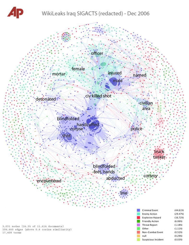
click for super hi-res version

Interpreting the Iraq War, December 2006
This is a picture of the 11,616 SIGACT (“significant action”) reports from December 2006, the bloodiest month of the war. Each report is a dot. Each dot is labelled by the three most “characteristic” words in that report. Documents that are “similar” have edges drawn between them. The location of the dot is abstract, and has nothing to do with geography. Instead, dots with edges between them are pulled closer together. This produces a series of clusters, which are labelled by the words that are most “characteristic” of the reports in that cluster. I’ll explain precisely what “similar” and “characteristic” mean later, but that’s the intuition.

Continue reading A full-text visualization of the Iraq War Logs

Best Visualizations of 2009

FlowingData just did a roundup the top 5 prettiest, awesomest, interestingest data visualizations of the year. I think it’s wonderful, because I think visualizations are important. The amount of data in the world is exploding, but human sense abilities are not.

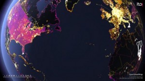
open-street-map-edits-545x306

It was a huge year for data. There’s no denying it. Data is about to explode.

Applications sprung up left and right that help you understand your data – your Web traffic, your finances, and your life. There are now online marketplaces that sell data as files or via API. Data.govlaunched to provide the public with usable, machine-readable data on a national scale. State and local governments followed, and data availability expands every day.

At the same time, there are now tons of tools that you can use to visualize your data. It’s not just Excel anymore, and a lot of it is browser-based. Some of the tools even have aesthetics to boot.

It’s exciting times for data, indeed.

Data has been declared sexy, and the rise of the data scientist is here.

With all the new projects this year, it was hard to filter down to the best, but here they are: two honorable mentions and the five best data visualization projects of 2009. Visualizations were chosen based on analysis, aesthetics, and most importantly, how well they told their story (or how well they let you tell yours).

Go here for the rest.

Since all I ever seem to write about these days is journalism (what with the journalism school, and the currently interning at a newspaper), here’s the tie-in:
Data is news now.

Deep, huh?

More pretty pictures at visualcomplexity.com, my very favorite infoviz site.

Why We Need Open Search, and How to Make Money Doing It

Anything that’s hard to put into words is hard to put into Google. What are the right keywords if I want to learn about 18th century British aristocratic slang? What if I have a picture of someone and I want to know who it is?  How to I tell Google to count the number of web pages that are written in Chinese?

We’ve all lived with Google for so long that most of us can’t even conceive of other methods of information retrieval. But as computer scientists and librarians will tell you, boolean keyword search is not the end-all. There are other classic search techniques, such as latent semantic analysis which tries to return results which are “conceptually similar” to the user’s query, even if the relevant documents don’t contain any of the search terms. I also believe that full-scale maps of the online world are important, I would like to know which web sites act as bridges between languages, and I want tools to track the source of statements made online. These sorts of applications might be a huge advance over keyword search, but large-scale search experiments are, at the moment, prohibitively expensive.

datacenter

The problem is that the web is really big, and only a few companies have invested in the hardware and software required to index all of it. A full crawl of the web is expensive and valuable, and all of the companies who have one (Google, Yahoo, Bing, Ask, SEOmoz) have so far chosen to keep their databases private. Essentially, there is a natural monopoly here. We would like a thousand garage-scale search ventures to bloom in the best Silicon Valley tradition, but it’s just too expensive to get into the business.

DotBot is the only open web index project I am aware of. They are crawling the entire web and making the results available for download via BitTorrent, because

We believe the internet should be open to everyone. Currently, only a select few corporations have access to an index of the world wide web. Our intention is to change that.

Bravo! However, a web crawl is a truly enormous file. The first part of the DotBot index, with just 600,000 pages, clocks in at 3.2 gigabytes. Extrapolating to the more than 44 billion pages so far crawled, I estimate that they currently have 234 terabytes of data. At today’s storage technology prices of about $100 per terabyte, it would cost $24,000 just to store the file. Real-world use also requires backups, redundancy, and maintenance, all of which push data center costs to something closer to $1000 per terabyte. And this says nothing of trying to download a web crawl over the network — it turns out that sending hard drives in the mail is still the fastest and cheapest way to move big data.

Full web indices are just too big to play with casually; there will always be a very small number of them.

I think the solution to this is to turn web indices and other large quasi-public datasets into infrastructure: a few large companies collect the data and run the servers, other companies buy fine-grained access at market rates. We’ve had this model for years in the telecommunications industry, where big companies own the lines and lease access to anyone who is willing to pay.

The key to the whole proposition is a precise definition of access. Google’s keyword “access” is very narrow. Something like SQL queries would expand the space of expressible questions, but you still couldn’t run image comparison algorithms or do the computational linguistics processing necessary for true semantic search. The right way to extract the full potential of a database is to run arbitrary programs on it, and that means the data has to be local.

The only model for open search that works both technologically and financially is to store the web index on a cloud, let your users run their own software against it, and sell the compute cycles.

It is my hope that this is what DotBot is up to. The pieces are all in place already: Amazon and others sell cheap cloud-computing services, and the basic computer science of large-scale parallel data processing is now well understood. To be precise, I want an open search company that sells map-reduce access to their index. Map-reduce is a standard framework for breaking down large computational tasks into small pieces that can be distributed across hundreds or thousands of processors, and Google already uses it internally for all their own applications — but they don’t currently let anyone else run it on their data.

I really think there’s money to be made in providing open search infrastructure, because I really think there’s money to be made in better search. In fact I see an entire category of applications that hasn’t yet been explored outside of a few very well-funded labs (Google, Bellcore, the NSA): “information engineering,” the question of what you can do with all of the world’s data available for processing at high speed. Got an idea for better search? Want to ask new questions of the entire internet? Working on an investigative journalism story that requires specialized data-mining? Code the algorithm in map-reduce, and buy the compute time in tenth-of-a-second chunks on the web index cloud. Suddenly, experimentation is cheap — and anyone who can figure out something valuable to do with a web index can build a business out of it without massive prior investment.

The business landscape will change if web indices do become infrastructure. Most significantly, Google will lose its search monopoly. Competition will probably force them to open up access their web indices, and this is good. As Google knows, the world’s data is exceedingly valuable — too valuable to leave in the hands of a few large companies. There is an issue of public interest here. Fortunately, there is money to be made in selling open access. Just as energy drives change in physical systems, money drives changes in economic systems. I don’t know who is going to do it or when, but open search infrastructure is probably inevitable. If Google has any sense, they’ll enter the search infrastructure market long before they’re forced (say,  before Yahoo and Bing do it first.)

Let me know when it happens. There are some things I want to do with the internet.
Mapping the Daily Me

If we deliver to each person only what they say they want to hear, maybe we end up with a society of narrow-minded individualists. It’s exciting to contemplate news sources that (successfully) predict the sorts of headlines that each user will want to read, but in the extreme case we are reduced to a journalism of the Daily Me: each person isolated inside their own little reflective bubble.

The good news is, specialized maps can show us what we are missing. That’s why I think they need to be standard on all information delivery systems.

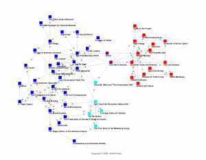
For the first time in history, it is possible to map with some accuracy the information that free-range consumers choose for themselves. A famous example is the graph of political booksales produced by orgnet.com:

Social network graph of Amazon sales of political books, 2008

Here, two books are connected by a line if consumers tended to buy both. What we see is what we always suspected: a stark polarization. For the most part, each person reads either liberal or conservative books. Each of us lives in one information world but not the other. Despite the Enlightenment ideal of free debate, real-world data shows that we do not seek out contradictory viewpoints.

Which was fine, maybe, when the front page brought them to us. When information distribution was monopolized by a small number of newspapers and broadcasters, we had no choice but to be exposed to stories that we might not have picked for ourselves. Whatever charges one can press against biased editors of the past, most of them felt that they had a duty to diversity.

In the age of disaggregation, maybe the money is in giving people what they want. Unfortunately, there is a real possibility that we want is to have our existing opinions confirmed. You and I and everyone else are going to be far more likely to click through from a headline that confirms what we already believe than from one which challenges us. “I don’t need to read that,” we’ll say, “it’s clearly just biased crap.” The computers will see this, and any sort of recommendation algorithm will quickly end up as a mirror to our preconceptions.

It’s a positive feedback loop that will first split us along existing ideological cleavages, then finer and finer. In the extreme, each of us will be alone in a world that never presents information to the contrary.

We could try to design our systems to recommend a more diverse range of articles (an idea I explored previously) but the problem is, how? Any sort of agenda-setting system that relies on what our friends like will only amplify polarities, while anything based on global criteria is necessarily normative — it makes judgements on what everyone should be seeing. This gets us right back into all the classic problems of ideology and bias — how do we measure diversity of viewpoint? And even if we could agree on a definition of what a “healthy” range sources is, no one likes to be told what to read.

I think that maps are the way out. Instead of trying to decide what someone “should” see, just make clear to them what they could see.

An information consumption system — an RSS reader, online newspapers, Facebook — could include a map of the infosphere as a standard feature. There are many ways to draw such a map, but the visual metaphor is well-established: each node is an information item (an article, video, etc.) while the links between items indicate their “similarity” in terms of worldview.

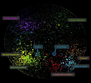
iran_blogosphere_map

This is less abstract than it seems, and with good visual design these sorts of pictures can be immediately obvious. Popular nodes could be drawn larger; closely related nodes could be clustered. The links themselves could be generated from co-consumption data: when one user views two different items, the link between those items gets slightly stronger. There are other ways of classifying items as related — as belonging to similar worldviews — but co-consumption is probably as good a metric as any, and in fact co-purchasing data is at the core of Amazon’s successful recommendation system.

The concepts involved are hardly new, and many maps have been made at the site level where each node is an entire blog, such as the map of the Iranian blogosphere above. However, we have never had a map of individual news items, and never in real-time for everyone to see.

Each map also needs a “you are here” indicator.

This would be nothing more than some way of marking items that the user has personally viewed. Highlight them, center them on the map, and zoom in. But don’t zoom in too much. The whole purpose of the map is to show each of us how small, how narrow and unchallenging our information consumption patterns actually are. We will each discover that we live in a particular city-cluster of information sources, on a particular continent of language, ideology, or culture. A map literally lets you see this at a glance — and you can click on far-away nodes for instant travel to distant worldviews.

Giving people only what they like risks turning journalism into entertainment or narcissism. Forcing people to see things that they are not interested in is a losing strategy, and we there isn’t any obvious way to decide what we should see. Showing people a map of the broader world they live in is universally acceptable, and can only encourage curiosity.

How Your Friends Affect You, Now With Math

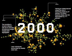
The New York Times Magazine and Wired both have major articles this week on recent empirical work in social networks, including significant research on how things like obesity, smoking, and even happiness spread between among groups of people. The Wired piece has better pictures

WiredSocialNetworks

while the NYT piece is more thorough and thoughtful, and covers both the potential and the pitfalls of this kind of analysis.

For decades, sociologists and philosophers have suspected that behaviors can be “contagious.” … Yet the truth is, scientists have never successfully demonstrated that this is really how the world works. None of the case studies directly observed the contagion process in action. They were reverse-engineered later, with sociologists or marketers conducting interviews to try to reconstruct who told whom about what — which meant that people were potentially misrecalling how they were influenced or whom they influenced. And these studies focused on small groups of people, a few dozen or a few hundred at most, which meant they didn’t necessarily indicate much about how a contagious notion spread — if indeed it did — among the broad public. Were superconnectors truly important? How many times did someone need to be exposed to a trend or behavior before they “caught” it? Certainly, scientists knew that a person could influence an immediate peer — but could that influence spread further? Despite our pop-cultural faith in social contagion, no one really knew how it worked.

We Have No Maps of The Web

web-from-space

We dream the internet to be a great public meeting place where all the world’s cultures interact and learn from one another, but it is far less than that. We are separated from ourselves by language, culture and the normal tendency to seek out only what we already know. In reality the net is cliquish and insular. We each live in our own little corner, only dimly aware of the world of information just outside. In this the internet is no different from normal human life, where most people still die within a few kilometers of their birthplace. Nonetheless, we all know that there is something else out there: we have maps of the world. We do not have maps of the web.

I have met people who have never seen a world map. I once had a conversation with herders in the south Sahara who asked me if Canada was in Europe. As we talked I realized that the patriarch of the settlement couldn’t name more than half a dozen countries, and had no idea how long it might take to get to any of the ones he did know. He simply had no notion of how big the planet was. And to him, the world really is small: he lives in the desert, occasionally catches a ride to town for supplies, and will never leave the country in which he was born.

Online, we are all that man. Even the most global and sophisticated among us does not know the true scope of our informational world. Statistics on the “size” of the web are surprisingly hard to come by and even harder to grasp; learning that there are a trillion unique URLs is like being told that the land area of the Earth is 148 million square kilometers. We really have no idea what we’re missing, no visceral experience that teaches our ignorance.

We can remedy this.

Continue reading We Have No Maps of The Web

Escaping the News Hall of Mirrors

We live in a cacaphony of news, but most of it is just echoes. Generating news is expensive; collecting it is not. This is the central insight of the news aggregator business model, be it a local paper that runs AP Wire and Reuters stories between ads, or web sites like Topix, Newser, and Memeorandum, or for that matter Google News. None of these sites actually pay reporters to research and write stories, and professional journalism is in financial crisis. Meanwhile there are more bloggers, but even more re-blogging. Is there more or less original information entering the web this year than last year? No one knows.

A computer could answer this question. A computer could trace the first, original source of any particular article or statement. The effect would be like donning special glasses in the hall of mirrors that is current news coverage, being able to spot the true sources without distraction from reflections. The required technology is nearly here.

This is more than geekery if you’re in a position of needing to know the truth of something. Last week I was researching a man named Michael D. Steele, after reading a newly leaked document containing his name. Steele gained fame as one of the stranded commanders in Black Hawk Down, but several of his soldiers later killed three unarmed Iraqi men. I rapidly discovered many news stories (1, 2, 3, 4, 5, 6, 7, etc.) claiming that Steele had ordered his men to “kill all military-age males.” This is a serious accusation, and widely reprinted — but no number of news articles, blog posts, and reblogs can make a false statement more true. I needed to know who first reported this statement, and its original source.

Continue reading Escaping the News Hall of Mirrors

How Many World Wide Webs Are There?

newblog-crop

How much overlap is there between the web in different languages, and what sites act as gateways for information between them? Many people have constructed partial maps of the web (such as the  blogosphere map by Matthew Hurst, above) but as far as I know, the entire web has never been systematically mapped in terms of language.

Of course, what I actually want to know is, how connected are the different cultures of the world, really? We live in an age where the world seems small, and in a strictly technological sense it is. I have at my command this very instant not one but several enormous international communications networks; I could email, IM, text message, or call someone in any country in the world. And yet I very rarely do.

Similarly, it’s easy to feel like we’re surrounded by all the international information we could possibly want, including direct access to foreign news services, but I can only read articles and watch reports in English. As a result, information is firewalled between cultures; there are questions that could very easily be answered by any one of tens or hundreds of millions of native speakers, yet are very difficult for me to answer personally. For example, what is the journalistic slant of al-Jazeera, the original one in Arabic, not the English version which is produced by a completely different staff?  Or, suppose I wanted to know what the average citizen of Indonesia thinks of the sweatshops there, or what is on the front page of the Shanghai Times today– and does such a newspaper even exist? What is written on the 70% of web pages that are not in English?

Continue reading How Many World Wide Webs Are There?

Social Network of US Counterinsurgency Policy Authors

coincrop-270109

Who is writing the major policies of the wars in Iraq and Afghanistan, and what is the Obama administration likely to do? There have been many analyses and news reports of individual policies and events, but it’s hard to wade into this flood of information, and besides, how would I know who to listen to? In an effort to get some perspective on at least one major aspect of American military strategy, I decided to plot out all the authors of (public) counterinsurgency policy over the last decade, and the relationships between them, as evidenced by co-authorship of articles and papers.

Continue reading Social Network of US Counterinsurgency Policy Authors