This Associated Press, my employer, has submitted the following proposal to the Knight News Challenge, reproduced here because the original on Knight’s site eats the paragraph breaks and doesn’t display the full-res image.

click for larger image, or awesome hi-res version
Describe your project:
Overview will be a tool for finding stories in large document sets, stories that might otherwise be missed. We will use the AP’s newsroom as a real-world environment to design and build a system to help journalists clean, visualize, and explore very large document sets — tens or hundreds of thousands of pages. We want to build a tool to answer the question, “what’s in there?”
Document dumps are becoming increasingly common, whether the result of freedom of information requests, government transparency initiatives, or leaks. It will never be possible to read every page, so a journalist’s understanding of a document set is only as good as their tools. Search tools can help you find exactly what you’re looking for, but don’t tell you anything about what you might have missed. Summary statistics such as word frequency (as popularized by tag clouds and Wordles) scan every page, but are often too general to be insightful. Journalists aren’t the only ones with this problem, and there are many well-developed techniques for making sense of very large document collections, in fields such as intelligence and scientific research. Overview will apply the best of these to journalism.
Visualization is important because it allows the reporter to see patterns in the documents. The goal is not pictures, but insight. Techniques like clustering can provide an instant understanding of the main topics of discussion, threaded displays can be used to trace conversations, and entity relationship diagrams show key people, organizations, and places at a glance. Filtering tools will let the reporter zoom in on interesting potential stories. We’re trying to build an interactive system where the computers do the visualization while a human guides the exploration.
The right algorithms are crucial, but things like data clean-up and import are often bigger real-world obstacles to getting something out of a huge document dump. Journalists are also frequently unaware of the potential of these sorts of visual exploration techniques, and how to use them, so we will develop and distribute comprehensive training materials to go along with Overview. We are focused on the practical realities of journalism, and the AP’s everyday needs will drive the development of the system.
No one tool or process is going to work on all types of document dumps, so Overview will be a modular toolbox, designed for exploration and experimentation. When the reporter finds an interesting story, they’ll be able to take a snapshot of the current visualization settings and produce a distributable HTML interactive. We also hope to integrate with DocumentCloud so that journalists who use that tool can use it as a document storage back end.
The technology isn’t new and has existed in other fields, but it hasn’t been tailored to the needs of journalism. We have an opportunity to take these existing techniques and create a system that will allow journalists to find stories they didn’t know existed — and to find them quickly.
How will your project improve the delivery of news and information to geographic communities?
Because the Overview system will be freely available with its included training material, any community can use it to explore their own records and documents, or to find the stories of interest to them within larger document sets. We would like to put this capability within reach of the smallest newsroom, and individuals.
What unmet need does your proposal answer?
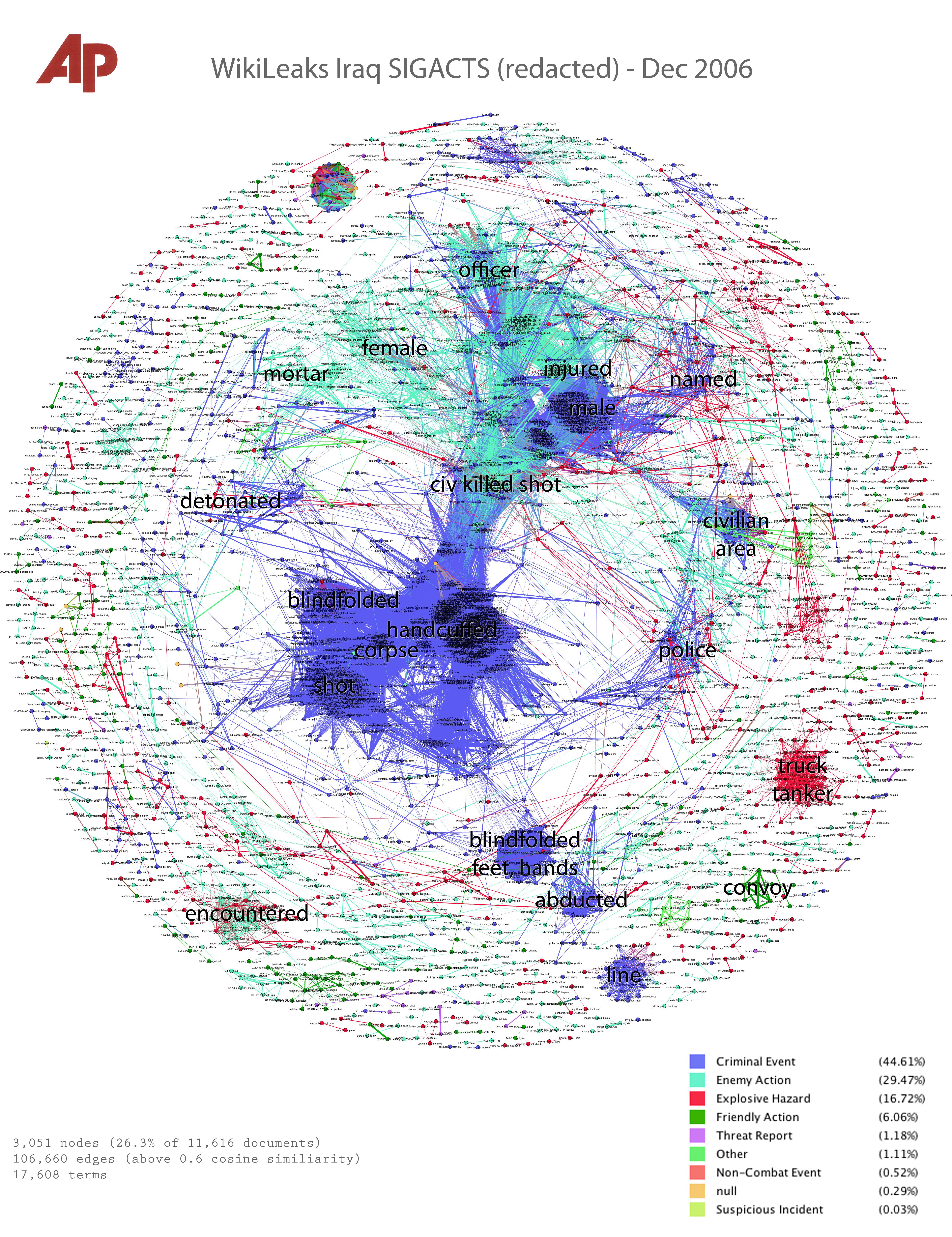
To take one example, there are almost 400,000 documents in the Iraq war logs. Each is a report of a specific event. We’ve seen plots on maps of Iraq and graphs of casualties over time, and many reporters have spent many hours dreaming up words to search for, but the full potential of such rich material remains untapped.
We’ve attached an example of the sort of visual exploration that might help us discover what we’re missing. Each dot is a SIGACT from December 2006, the bloodiest month of the war. They’re colored by the report type: criminal event, enemy action, explosive hazard etc. That much is already in the data. But we’ve clustered them by an algorithmic comparison of the full text of each report. Clusters are labeled by the words that are most characteristic of that cluster. (We used TF-IDF and cosine similarity, standard text analytics techniques that are rarely applied to journalism.)
The visualization gives a sense of the scale and composition of the war that month. The large central blue cluster is murders, marked by the word “corpse.” Details of the death produce other sub-clusters, such as “shot” and “handcuffed.” Sectarian killings appear appear a little bit to the side, marked with the words “blindfolded,” “feet,” and “hands.” The murders intersect somewhat with enemy action reports (cyan) and are disjoint from a group of tanker truck explosive hazards (red).
We believe that techniques like this are useful in answering the high-level question of “what’s in there?” for all of the massive document dumps journalists now face, whether from FOIA requests, leaks, or government transparency initiatives. And we believe that much more is possible, and that we have the appropriate journalist and technological expertise, as well as contacts within the research community, to build a truly useful system.
How is your idea new?
There are reasonably good tools for finding what we already suspect is lurking in a large set of documents, but journalists are almost powerless to get a reliable sense of where to look for stories that they are not already thinking about. There are other visual analytics packages available, but they are not free, run far too slowly on large document sets, or lack certain key features such as data cleanup and publishing. Overview will be an open-source, production-quality visual analytics system designed specifically for journalistic understanding and discovery within large sets of unstructured or semi-structured text documents, and distributed with comprehensive training materials.
What will you have changed by the end of the project?
All journalists will have access to a sophisticated and extensible large document set exploration and analysis tool. This will particularly improve the ability of small newsrooms and freelancers to find stories in massive document sets, such as those released under government transparency initiatives.
Why are you the right person or team to complete this project?
We have assembled a world-class team to develop a powerful visual exploration tool for journalistic discovery. Jonathan Stray, Interactive Technology Editor at the Associated Press, was formerly a senior computer scientist at Adobe and has brought many research techniques into production graphics software. Stray will be the journo-tech lead, acting as newsroom engineering manager on the project and responsible for the software. Rick Pienciak is a veteran investigative reporter and the head of the Associated Press’ investigative team. Pienciak will ensure that the work is relevant to real-world journalism. The AP will be working with Dr. John Stasko, a professor at Georgia Tech who leads the development of the Jigsaw visual analytics system, and has agreed to be a research consultant on the project. To this team we will add two newly hired developers, which is the what the majority of the grant money will be spent on.
What terms best describe your project?
document set, document dump, visual analytics, information visualization, text analysis, entity relationships, topic clustering, sense-making, transparency, search
Very impressive proposal. The idea to make the resulting software open to others is also commendable- I could see this being useful for Historical data sets as well. For example, I would love to use this technique to help visualize activity of Russian Peasant behavior, be that examples of resistance or location of markets and the goods they sold, just to name a few. As these ‘data dumps’ become more commonplace, tools such Overview will no doubt become indispensable in order to make comprehendible the waterfall of bytes.
This could be a very useful tool, not just for journalists but also for analysts working to distill recommendations for policy makers from large datasets. Have you considered how this could be applied to real-time data (rather than historical archives)? Possible applications to large crowdsourced datasets?
Hi,
This is a very exciting proposal! Do you plan to use Gephi Platform to develop such a tool?
No, we’re using Gephi for prototypes but it’s not suitable for a production system. It doesn’t have the sorts of graph layouts we need, it’s not designed to handle hundreds of thousands of nodes, and we wouldn’t be able to integrate it well into a larger interactive system.
Did you ever get any funding for this? Where is the project currently at? I would like to help.
The project passed the first round of the Knight News Challenge. There are two more rounds — final decisions will be this summer, but it looks good so far.