If we deliver to each person only what they say they want to hear, maybe we end up with a society of narrow-minded individualists. It’s exciting to contemplate news sources that (successfully) predict the sorts of headlines that each user will want to read, but in the extreme case we are reduced to a journalism of the Daily Me: each person isolated inside their own little reflective bubble.
The good news is, specialized maps can show us what we are missing. That’s why I think they need to be standard on all information delivery systems.
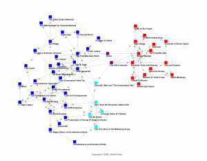
For the first time in history, it is possible to map with some accuracy the information that free-range consumers choose for themselves. A famous example is the graph of political booksales produced by orgnet.com:
Here, two books are connected by a line if consumers tended to buy both. What we see is what we always suspected: a stark polarization. For the most part, each person reads either liberal or conservative books. Each of us lives in one information world but not the other. Despite the Enlightenment ideal of free debate, real-world data shows that we do not seek out contradictory viewpoints.
Which was fine, maybe, when the front page brought them to us. When information distribution was monopolized by a small number of newspapers and broadcasters, we had no choice but to be exposed to stories that we might not have picked for ourselves. Whatever charges one can press against biased editors of the past, most of them felt that they had a duty to diversity.
In the age of disaggregation, maybe the money is in giving people what they want. Unfortunately, there is a real possibility that we want is to have our existing opinions confirmed. You and I and everyone else are going to be far more likely to click through from a headline that confirms what we already believe than from one which challenges us. “I don’t need to read that,” we’ll say, “it’s clearly just biased crap.” The computers will see this, and any sort of recommendation algorithm will quickly end up as a mirror to our preconceptions.
It’s a positive feedback loop that will first split us along existing ideological cleavages, then finer and finer. In the extreme, each of us will be alone in a world that never presents information to the contrary.
We could try to design our systems to recommend a more diverse range of articles (an idea I explored previously) but the problem is, how? Any sort of agenda-setting system that relies on what our friends like will only amplify polarities, while anything based on global criteria is necessarily normative — it makes judgements on what everyone should be seeing. This gets us right back into all the classic problems of ideology and bias — how do we measure diversity of viewpoint? And even if we could agree on a definition of what a “healthy” range sources is, no one likes to be told what to read.
I think that maps are the way out. Instead of trying to decide what someone “should” see, just make clear to them what they could see.
An information consumption system — an RSS reader, online newspapers, Facebook — could include a map of the infosphere as a standard feature. There are many ways to draw such a map, but the visual metaphor is well-established: each node is an information item (an article, video, etc.) while the links between items indicate their “similarity” in terms of worldview.
This is less abstract than it seems, and with good visual design these sorts of pictures can be immediately obvious. Popular nodes could be drawn larger; closely related nodes could be clustered. The links themselves could be generated from co-consumption data: when one user views two different items, the link between those items gets slightly stronger. There are other ways of classifying items as related — as belonging to similar worldviews — but co-consumption is probably as good a metric as any, and in fact co-purchasing data is at the core of Amazon’s successful recommendation system.
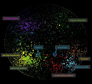
The concepts involved are hardly new, and many maps have been made at the site level where each node is an entire blog, such as the map of the Iranian blogosphere above. However, we have never had a map of individual news items, and never in real-time for everyone to see.
Each map also needs a “you are here” indicator.
This would be nothing more than some way of marking items that the user has personally viewed. Highlight them, center them on the map, and zoom in. But don’t zoom in too much. The whole purpose of the map is to show each of us how small, how narrow and unchallenging our information consumption patterns actually are. We will each discover that we live in a particular city-cluster of information sources, on a particular continent of language, ideology, or culture. A map literally lets you see this at a glance — and you can click on far-away nodes for instant travel to distant worldviews.
Giving people only what they like risks turning journalism into entertainment or narcissism. Forcing people to see things that they are not interested in is a losing strategy, and we there isn’t any obvious way to decide what we should see. Showing people a map of the broader world they live in is universally acceptable, and can only encourage curiosity.


Oh so true. Don’t most of us buy the very same paper on the weekend and follow that little or wider niche of blogs and news sources? I’m not sure that it’s a function of narcissism though – I think people mostly respect and trust sources that are aligned with their political/moral values and would think that the ‘other’ media tweak the information. It’s true that in the end this boils down to ‘me, me, you are like me, you must be right’, but I doubt that this is a conscious decision. Facts are facts, but they are often bound to be colored by the messenger’s views and if that messenger is from a political or a moral camp you’re fighting, I doubt you’re going to seek out exposure to his or her delivery for a purpose different than seeking to sharpen your own end of the argument. Or am I pessimistic?
I’ve followed the issue of climate change on both sides and still do just because the wealth of information about it and the range of opinion is so rich and there is much to understand from the point of science. Still, as far as politics go I can’t say I venture on a really wide range of news/opinion sources, I normally stick around with my dear Economist and a couple of other things as far as mass media go.
We already live in bubbles, and as we move towards customized delivery it’s going to get worse. It wouldn’t be hard to build a recommendation-based news delivery platform that learned what you’re likely to read and delivered it to you. This would be of tremendous value to users and advertisers alike. But at that point, you’re stuck in a feedback loop, only ever exposed to ideas very “similar” (by some metric) to the ones you’ve appreciate in the past.
It’s also not just a question of “coloring” the same facts but the broader issue of what stories get reported — not just reported by anyone, but reported to you in particular with your particular expressed preferences.
So despite the increasing wealth of resources available to everyone, the rise of customizable information delivery suggests that this problem of information-world balkanization might actually get worse before it gets better. This is a real possibility that needs to be addressed, and maps are my best answer to the problem. Anyway, as you know I am a fan of information visualization in general — I think it’s a key way of understanding the modern world.
You take it as a given that the mapping system must be non-ideological and unbiased. Why?
First of all, is that even possible? The idea of plural voices isn’t neutral. If you want to say “within the Western pluralistic tradition, let’s be non-ideological” that’s another thing (which excludes pretty much all religious believers).
Secondly, the ultimate source of ideology in the mass media is its institutional bias. Certain sources are privileged, others are ignored. It’s got very little to do with the ideology of the people that produce the program; it’s about what’s economically possible and what’s institutionally permissible. The same constraints will apply to any machine algorithm as well, so it will have its ideological biases too.
Even with all this said, I think the mapping concept is a really cool idea and would have real benefits. I’m still not sure people will use it the way you intend, like “oh, what else am I missing”. It might just become a vetting tool, a way of enforcing dogma. Like, “why are you over there halfway to libertarianism? Get back into the mainstream of Democratic thought or else”.
I guess I just don’t see the problem as a failure to expose different ideologies. Differing ideologies are all that we GET nowadays. It’s that we don’t have news institutions that are motivated to examine claims for veracity or make long term investments in the same.
“You take it as a given that the mapping system must be non-ideological and unbiased. Why?”
One reason is that I want every government in the world to accept it. That’s probably not possible, but at least no one would be able to say that some subset of the available information was being ideologically privileged in some way.
I also think that curiosity — “what else am I missing?” — is the only plausible route for large-scale shifts in belief. There’s increasing empirical evidence that just telling people that their worldview is wrong doesn’t work, see e.g. this discussion of a recent study.