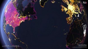
FlowingData just did a roundup the top 5 prettiest, awesomest, interestingest data visualizations of the year. I think it’s wonderful, because I think visualizations are important. The amount of data in the world is exploding, but human sense abilities are not.
It was a huge year for data. There’s no denying it. Data is about to explode.
Applications sprung up left and right that help you understand your data – your Web traffic, your finances, and your life. There are now online marketplaces that sell data as files or via API. Data.govlaunched to provide the public with usable, machine-readable data on a national scale. State and local governments followed, and data availability expands every day.
At the same time, there are now tons of tools that you can use to visualize your data. It’s not just Excel anymore, and a lot of it is browser-based. Some of the tools even have aesthetics to boot.
It’s exciting times for data, indeed.
Data has been declared sexy, and the rise of the data scientist is here.
With all the new projects this year, it was hard to filter down to the best, but here they are: two honorable mentions and the five best data visualization projects of 2009. Visualizations were chosen based on analysis, aesthetics, and most importantly, how well they told their story (or how well they let you tell yours).
Go here for the rest.
Since all I ever seem to write about these days is journalism (what with the journalism school, and the currently interning at a newspaper), here’s the tie-in:
Data is news now.
Deep, huh?
More pretty pictures at visualcomplexity.com, my very favorite infoviz site.

VC is a compendium of the best, but I would recommend Information Is Beautiful (see book, the visual miscellaneum).
Also, do check out the following “best of” data vis websites:
http://www.inspiredm.com/2009/10/10/20-essential-infographics-data-visualization-blogs/