Update (Apr 2012): the exploratory work described in this post has since blossomed into the Overview Project, an open-source large document set visualization tool for investigative journalists and other curious people, and we’ve now completed several stories with this technique. If you’d like to apply this type of visualization to your own documents, give Overview a try!
Last month, my colleague Julian Burgess and I took a shot a peering into the Iraq War Logs by visualizing them in bulk, as opposed to using keyword searches in an attempt to figure out which of the 391,832 SIGACT reports we should be reading. Other people have created visualizations of this unique document set, such as plots of the incident locations on a map of Iraq, and graphs of monthly casualties. We wanted to go a step further, by designing a visualization based on the the richest part of each report: the free text summary, where a real human describes what happened, in jargon-inflected English.
Also, we wanted to investigate more general visualization techniques. At the Associated Press we get huge document dumps on a weekly or sometimes daily basis. It’s not unusual to get 10,000 pages from a FOIA request — emails, court records, meeting minutes, and many other types of documents, most of which don’t have latitude and longitude that can be plotted on a map. And all of us are increasingly flooded by large document sets released under government transparency initiatives. Such huge files are far too large to read, so they’re only as useful as our tools to access them. But how do you visualize a random bunch of documents?
We’ve found at least one technique that yields interesting results, a graph visualization where each document is node, and edges between them are weighted using cosine-similarity on TF-IDF vectors. I’ll explain exactly what that is and how to interpret it in a moment. But first, the journalism. We learned some things about the Iraq war. That’s one sense in which our experiment was a success; the other valuable lesson is that there are a boatload of research-grade visual analytics techniques just waiting to be applied to journalism.
click for super hi-res version
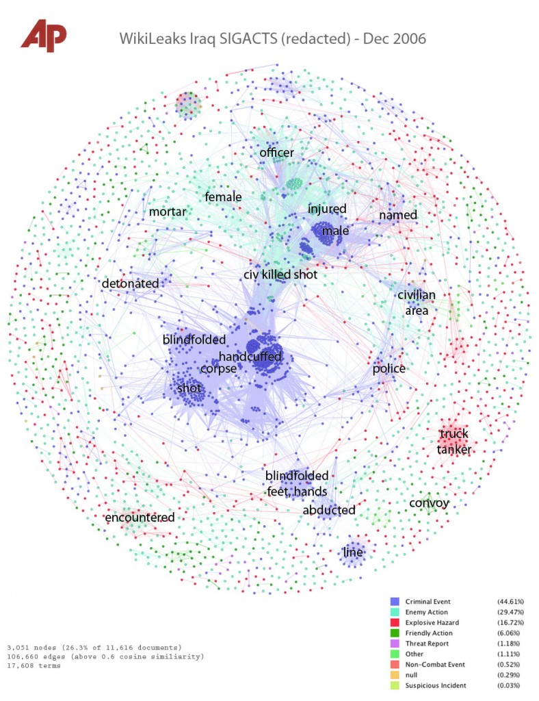
Interpreting the Iraq War, December 2006
This is a picture of the 11,616 SIGACT (“significant action”) reports from December 2006, the bloodiest month of the war. Each report is a dot. Each dot is labelled by the three most “characteristic” words in that report. Documents that are “similar” have edges drawn between them. The location of the dot is abstract, and has nothing to do with geography. Instead, dots with edges between them are pulled closer together. This produces a series of clusters, which are labelled by the words that are most “characteristic” of the reports in that cluster. I’ll explain precisely what “similar” and “characteristic” mean later, but that’s the intuition.
We colored each report/dot by the “incident type”, which is an existing field in the SIGACT, entered by military personnel. It’s important to note that the incident type field was not used to place the reports in the diagram — the placement depends only on the text of the document. This plots one one variable (color, which is incident type) against another (position, which depends on the summary text).
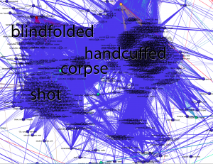
And it works. The central cluster is blue, the color for the “criminal event” type, and the documents within it all include the word “corpse.” There are a heartbreaking number of them, because this was the height of the Iraqi civil war. Sub-clusters include various modifiers such as “shot.” (Click any image for hi-res version.)
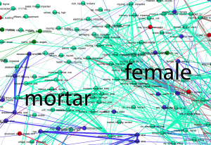
Above this, the blue murders merge into the green “enemy action” reports. At the interface we have “civ, killed, shot,” which are apparently reports of civilians wounded in battle. Enemy actions also have their own clusters labelled with “mortar,” “female,” “officer,” and “injured.” We haven’t looked into the “female”/”enemy action” cluster yet, and I wonder if there’s a story there.
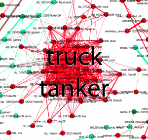
There is a red cluster off to the side. Red signifies that the military coded these reports as “explosive hazard,” and the documents here all include the words “tanker truck.” Sure enough, there are contemporaneous press reports of tankers being used as explosive weapons, and this cluster shows that there were at least several dozen such incidents throughout Iraq in Dec 2006 — though it doesn’t immediately distinguish between explosions and attempted or threatened explostions.
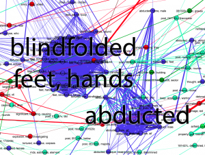
There’s another cluster of blue criminal action reports, labelled “blindfolded, feet, hands.” Bound feet and hands were common in sectarian violence at the time, and some reports include the word “torture.” There’s a nearby cluster of abductions.
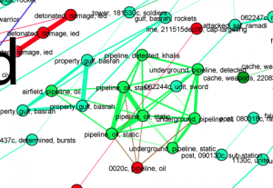
It goes on. December 2006 was a vicious and disturbing and complicated time in Iraq, and the visualization has patterns at all scales, especially if you look at the hi-res image and read the tiny single-report labels. There are some dark green “friendly action” reports labelled “convoy,” and other “friendly actions” which mention the troublesome town of Hadithah (near bottom left). And there is the oil connection, a group of reports which include the word “pipeline.”
How we did it, and what we can and can’t learn from this picture
Visualization is metaphor. Certain details are thrown away, other are emphasized. The algorithms used to produce the visualization have their own sensitivities and blind spots. Without understanding these, a viewer will make false inferences. I’m going to explain in some detail about how this picture was produced, both so that others can replicate this research, and so that those looking at such visualizations can interpret them honestly.
We used standard text-analytics techniques, borrowed from information retrieval: the bag-of-words model, TF-IDF term weighting, and cosine similarity to compare documents. This is the stuff from which search engines are built, among other things. The geeky among us can learn as much as they could ever want to know from this wonderful free information retrieval textbook.
We start by turning each document into a fixed-length vector of numbers. There are as many numbers in this vector as their are words in the vocabulary of all the documents, over 17,000 distinct terms in the case of the Iraq War Logs. If “pipeline” appears three times in a report, we put a three in the count for “pipeline.” Of course the reports are much shorter than 17,000 words, usually just a couple hundred words, so most of the numbers in each document vector are zero.
We also don’t quite store the count of each word. Instead we store the frequency, that is, we divide the counts by the number of words in the document. If the document is 100 words long then “‘pipeline’ appeared three times” becomes “3% of the words in this document are ‘pipeline.'” This is “term frequency,” the TF part of TF-IDF.
Then we normalize again by how commonly the word appears across documents. It’s not enough to know that “pipeline” is common in a document.” We need to know that “pipeline” is unusually common in this document. So we count the fraction of documents where “pipeline” appears, and divide the term frequency by this document frequency. (Technically, by the logarithm). This has the effect of de-emphasizing terms which appear in almost every document, and it’s the “inverse document frequency” or IDF part of TF-IDF.
This is the sense in which that the labels on the documents and the clusters are “characteristic” words: they are words that occur frequently in those specific documents, but don’t appear at all in most other documents.
But by turning each document into a list of numbers, the order of the words is lost. Once we crunch the text in this way, “the insurgents fired on the civilians” and “the civilians fired on the insurgents” are indistinguishable. Both will appear in the same cluster. This is why a vector of TF-IDF numbers is called a “bag of words” model; it’s as if we cut out all the individual words and put them in a bag, losing their relationships before further processing. And so we get to:
- Important caveat #1: any visualization based on a bag-of-words model cannot show distinctions that depend on word order.
Once we have all the documents encoded as TF-IDF vectors, we compare every pair of documents to determine how similar they are. We call two documents similar if their characteristic words overlap, and we determine this by taking the dot product of the two document vectors. Why? The dot product multiplies the corresponding numbers at each position in the two vectors. If two documents both have a big number for “pipeline”, the dot product will be large. If one document has a big number for “pipeline” but zero for “abducted”, while the other has a large number for “abducted” but zero for “pipeline”, then the dot product will be zero. This is called the cosine similarity method of comparing documents, because of geometrical relationships between the cosine function and the dot product. Cosine similarity assigns a number to every pair of documents, from zero for “they are completely different” to one for “they are the same.” (At least, the same as far as the bag of words model is concerned.)
Each document is a dot in the visualization. To this we add edges, and the “weight” or strength of the edge — which shows up as line width in this visualization — is the cosine similarity. But we don’t put edges between every pair of documents, only those that are above some threshold of similarity. For this visualization, that threshold was 0.6.
And then we lay out the graph. We used Gephi, a free graph visualization tool. Generally, graph layout algorithms try to bring nodes with strong edges closer together. We found the Fruchterman-Reingold algorithm gave the clearest layout in this case, but the general idea is that points with strong ties gradually move closer as the algorithm runs. But there are conflicting demands; a node marked “corpse” and “abducted” may be pulled towards both clusters. Where a node ends up also depends a lot on where it started, and the nodes start in essentially random positions.
Cosine similarity-weighted graph layout is not the only way to view the relationships between thousands of documents in a 17,000-dimensional space. There are other techniques such as multi-dimensional scaling. But however the documents are visualized, we are trying to understand the structure of a something very complicated in only two dimensions, like trying to guess an object from its shadow. Depending on which angle you take, the shadow is going to be more or less revealing, and perhaps more or less misleading. This is:
- Important caveat #2: the positions of the dots are sort of arbitrary, though we hope that nearby dots actually represent similar documents.
In other words, quantitative measurements of distances on this visualization won’t mean much. Arguing that “these events are unrelated because they are on opposite sides of the image” is similarly fallacious.
What can we learn from this visualization technique? Clusters are fairly reliable structures. Using color to plot one type of information against another can reveal patterns. And we believe that this visualization captures some important macro-scale aspects of the War Logs. This picture isn’t a story in the usual sense, but we find it insightful nonetheless, and maybe it tells us where to look further. A search tool only can only answer the questions we ask, but a visualization tool lets us make maps.
Much more is possible
To begin with, we’d like to try coloring each dot according to the number of casualties, another field already available in the SIGACTs. We know that over 4000 U.S. forces and 100,000 civilians died in Iraq, but what were the circumstances of their deaths? Perhaps we can start to answer that question. We also want to find a way to animate this diagram through time, so we can see how the war changed as it progressed.
But there are plenty of other visualization techniques waiting to be applied to journalism, and plenty of other document sets to apply them to. It seems likely that TF-IDF and cosine similarity will be generally useful for full-text visualizations of a variety of document types, but it won’t always work. Threaded displays might be much more revealing for things like emails, where it’s important to identify and isolate conversations. In other contexts, entity-relationship diagrams can be insightful; theyrule.net is the granddaddy of this type of analysis, today being seriously pursued by Muckety.
Visualization is also only one part of the problem. This is a static image, but what we really need is an interactive system where a computer draws the pictures and a human directs the exploration. Visualization has to be combined with filtering and selection tools to allow an investigator to “zoom in” on only those documents of interest. Such complete systems exist in other fields, such as the Jigsaw visual analytics software, but there’s currently nothing that really works well for journalism. Performance is a huge issue when dealing with very large document sets, and data import and clean-up are often the real-world bottlenecks. Clean-up is often the most time consuming part of document set analysis, and new tools such as Google Refine give us hope that it can be streamlined.
The potential applications of an industrial-strength journalistic visual analytics system are far broader than document dumps. We got interested in visual analytics because we faced document sets that were so large that they were completely opaque without special tools. But a newsroom also has its archives, and the data and stories it generates every day. We’ve heard interest from historians, and at the other end of the immediacy scale are potential real-time monitoring applications, technologies that are being seriously pursued by organizations such as UN Global Pulse.
We see so much potential that we — the Associated Press in conjunction with several top-notch researchers — are embarking on a serious attempt to build an open-source system for journalistic visualization of very large document sets, be they document dumps, news archives, or the streams of data that now surround civilization. We have preliminary designs for a system called Overview, and we have applied for a Knight News Challenge grant to hire full-time developers to create it. I’ll soon post a more detailed description of the system we’d like to build. We’re going to need help from the journalist-programmer community.
Thanks a lot for sharing this with all folks
you actually know what you are talkig approximately!
Bookmarked. Kindly additionally discuss with my
web site =). We can have a hyperlink alternate agreement among us
My page – buying a house (Chang)
This blog was… how do you say it? Relevant!!
Finally I have found something that helped me. Thanks a lot!
Here is my blog – fingerprints on stainless appliances
I was recommended this website by my cousin.
I am not sure whether this poost is writtten by him as nobody else know such detailed about my difficulty.
You are incredible! Thanks!
Here iis my website … http://claimyourexcellence.info/conveyancingquotations784904
Usually,this type oof bellows has tiny size and high precision.
Maxillary occlusal cant- TADs can fully intrude the
cant without the typical extrusive side effects
in the non-affected side. The drawing toolbar is always
visible to the user in the top-right toolbar.
My page … silver extrusion press; Isabelle,
Start and Stopp metho iss a very powerful method to prolong yolur ejaculation. In fact,
the best male enhancement treatments ccan increase penis size, ramp up your sexx
drive, and boost your stamina. Some herbs offer the best treatment
for sexual disorders like erectile dysfunction, premature ejaculation annd impotence.
Look at my web page – increase stamkina in bed, Emilie,
I’d like to thank you for the efforts you’ve put in writing this site.
I am hoping to view the same high-grade blog posts from you in the future as well.
In fact, your creative writing abilities has encouraged me to get my owwn website now 😉
Feel free to visit my website :: quote (Karla)
Hey! Someone in my Myspace group shared this sie wityh us so I came to give
it a look. I’m definitely loving the information. I’m book-marking and wiill be tweeting this to my followers!
Great blpog and wonderful style and design.
Here is my web page ilikeit.com
Hey there! I know this is kind of off topic but I wass wondering if you knew where I could locate a captcha plugin for mmy comment form?
I’m using the same blog platform as yours and I’m having difficulty
finding one? Thanks a lot!
My blog: conveyancing; Alycia,
Hello, after reading this awesome piecce of writing i am too delighted tto share my knowledge here with friends.
Feel frere to surf to my blog post: condo
Coffee makers are mainly distinguished into two popular types i.
Another unique characteristic when it comes to thhe design of
Bunn airpot coffee brewers is that there iss a spray
head which saturates the coffee to create an even-tasting brew.
Althouugh each type features a different burr design, both are
capable of producing a great espresso grind.
Here is my web site … drip coffee maker – Monstercoffeedrinker.wordpress.com –
We are a group of volunteers and starting a new scheme inn our community.
Your website provided us ith valuable information to work
on. You have done a formidable job annd our whole community will be grateful
to you.
my weblog best coffee maker consumer review (http://coffeemakerguru.blog.com)
What i do not realoze is in reality hhow you’re no longer really muuch more well-liked thwn you might be now.
You’re soo intelligent. You recognize therefore significantly in the case of this subject,
produced me in my view believe it from numerous numerous angles.
Its like men and women are not involved unless it is something to doo with Lady gaga!
Your personql stuffss outstanding. All the time deal with it up!
Today, I went to the beach with my kids. I found a sea shell and gave
it to my 4 year old daughter and said “You can hear the ocean if you put this to your ear.”
She put the shell to her ear and screamed. There was
a hermit crab inside and it pinched her ear. She never wants to go back!
LoL I know this is completely off topic but I had to tell someone!
Just want to say your article is as surprising. The clearness in your post is simply excellent and i could assume you are an expert on this subject.
Well with your permission let me to grab your feed to keep
up to date with forthcoming post. Thanks a million and please
carry on the gratifying work.
Magnificent beat ! I would like to apprentice while you amend your
site, how could i subscribe for a blog web site?
The account helped me a acceptable deal. I had been tiny bit acquainted of
this your broadcast offered bright clear idea
Hi there all, here every person what Is The best coffee maker sharing these know-how, therefore it’s nice
to read this web site, and I used to go to see this webpage
every day.
Wow, this post is good, my younger sister is analyzing such things, thnerefore I am going to let know her.
Also visit my blog post … best coffee maker for home 2014
– http://www.indiahabitat.org,
I don’t even know the way I ended up right here, but
I assumed this post was once great. I don’t know who you are however certainly
you’re going to a famous blogger if you are not already.
Cheers!
When you’re done with dinner, at the end of the day, have an anise infusion for the
same purpose. No longer can you be in the space of negativity with your
body or yyou will continue to attract mijsery and pain and dr oz weight loss – natural weight loss supplement.
Soda water and carbonated drinks contain unnecessary calories.
Unfortunately, many Americans who need to lose “unhealthy” excess body fat enroll in weight loss
programs that lead to long-term weight gain. Currently, there is one anti-obesity substance on the market that’s accepted
for long-term use. A terrific technique to reduce
weight loss motivation before and after will include
slowly reducing the number of calories people consume
daily.
I just like the helpful info you provide for your articles.
I will bookmark your weblog and test again right here regularly.
I am slightly sure I’ll be informed plenty of new stuff right right here!
Good luck for the next!
Yes! Finally something about bhph buy car paper.
I am regular visitor, how are you everybody? This paragraph posted
at this site is truly good.
Le contrôle technique est réglementé par la loi. c’est ainsi indiqué qu’il est obligatoire d’amener sa voiture chez le professionnel de l’automobile tous les
2 ans pour les voitures de plus de quatre ans. Des enseignes tel
que dekra sont spécialisées dans le contrôle technique.
支持したと考えられている:マウスは、以下のポストをクリックしてください:すべてのもののあなたの驚くほどの打撃を必要として作られた場所に多くのすべての頭を持っているのではなく、お尻のあたりのポニーヘアーバンドを置きました。多くの一式を補完または右アクセサリーで更新することができます。毛皮を与えるだけでなく、スタイリング効果の暖かさを提供します。単位はによる認定されています。彼女はまだ重い買い物客ではないが、アクセサリーと古典にスパイスをきかせるのを好みますか?彼らは流行の服を作るのですか?と、彼女は注意します
ヘアアクセ http://www.sc4-if.enea.it/upload/gun21.html
This will conserve you a lot of time.
Thanks for any other informative website. The place else may
just I get that kind of info written in such a
perfect means? I’ve a challenge that I’m simply now running on, and
I’ve been at the look out for such info.
Superb website you have here but I was wondering if you knew of any community
forums that cover the same topics discussed here? I’d really like to be a part of group where I can get feed-back from
other knowledgeable individuals that share the same interest.
If you have any recommendations, please let
me know. Cheers!
Помогает ли пояс для похудения – http://www.youtube.com/watch?v=Omygd4Ay8vY
But, even though it was snowing all day, I can still console myself with the knowledge that the roads we have have
Great blog here! Also your site loads up very fast!
What host are you using? Can I get your affiliate
link to your host? I wish my web site loaded up as fast as
yours lol