Jonathan Stray’s blog

UN asks Ushahidi to produce Crisis Map of Libya

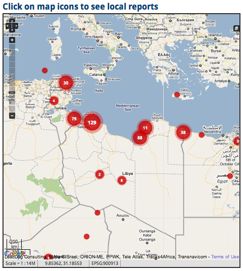
Patrick Meier and some of the rest of the team behind the amazing Haiti earthquake crisis mapping effort have set up a Libya Crisis Map which plots tweets and many of other kinds of on-the-ground reports on a map of the country. The reports come from citizens and journalists and aid agencies and anyone else, and each is tagged as “verified” or “unverified.” Sensitive information, which might be used to retaliate against sources or others, is redacted.

Meier recently wrote about how the Libyan situation differs from Haiti. The situation is much more politically complex than Haiti, but also, this time the UN’s OCHA relief coordination agency asked for the map:

The second reason why this is no Haiti is because the request for activation of the Standby Task Force to provide live crisis mapping support came directly from the UN OCHA’s Information Management unit in Geneva. This was not the case in Haiti since there was no precedent for the crisis mapping efforts we launched at the time. We did not have buy in from the humanitarian community and the latter was reluctant to draw on anything other than official sources of information. Crowdsourcing and social media were unchartered territories. OCHA also reached out to CrisisCommons and OpenStreetMap and we are all working together more closely than ever before.

Contrast this to the case of Libya this week which saw an established humanitarian organization specifically request a volunteer technical community for a live map of reports generated from Twitter, Facebook, Flickr, YouTube and mainstream media sources. Seriously, I have never been more impressed by the humanitarian community than I am today. The pro-active approach they have taken and their constructive engagement is absolutely remarkable. This is truly spectacular and the group deserve very high praise.

Definitely worth taking a look at the map. More on the process at UN Global Pulse.

Investigating thousands (or millions) of documents by visualizing clusters

This is a recording of my talk at the NICAR (National Institute of Computer-Assisted Reporting) conference last week, where I discuss some of our recent work at the AP with the Iraq and Afghanistan war logs.

References cited in the talk:

  • “A full-text visualization of the Iraq war logs”, a detailed writeup of the technique used to generate the first set of maps presented in the talk.
  • The Glimmer high-performance, parallel multi-dimensional scaling algorithm, which is the software I presented in the live demo portion. It will be the basis of our clustering work going forward. (We are also working on other large-scale visualizations which may be more appropriate for e.g. email dumps.)
  • “Quantitative Discovery from Qualitative Information: A General-Purpose Document Clustering Methodology.” Justin Grimmer, Gary King, 2009. A paper that everyone working in document clustering needs to read. It clearly makes the point that there is no “best” clustering, just different algorithms that correspond to different pre-conceived frames on the story — and gives a method to compare clusterings (though I don’t think it will scale well to millions of docs.)
  • Wikipedia pages for bag of words model, tf-idf, and cosine similarity, the basic text processing techniques we’re using.
  • Gephi, a free graph visualization system, which we used for the one-month Iraq map. It will work up to a few tens of thousands of nodes.
  • Knight News Challenge application for “Overview,” the open-source system we’d like to build for doing this and other kinds of visual explorations of large document sets. If you like our work, why not leave a comment on our proposal?

A computational journalism reading list

[Last updated: 18 April 2011 — added statistical NLP book link]

There is something extraordinarily rich in the intersection of computer science and journalism. It feels like there’s a nascent field in the making, tied to the rise of the internet. The last few years have seen calls for a new class of  “programmer journalist” and the birth of a community of hacks and hackers. Meanwhile, several schools are now offering joint degrees. But we’ll need more than competent programmers in newsrooms. What are the key problems of computational journalism? What other fields can we draw upon for ideas and theory? For that matter, what is it?

I’d like to propose a working definition of computational journalism as the application of computer science to the problems of public information, knowledge, and belief, by practitioners who see their mission as outside of both commerce and government. This includes the journalistic mainstay of “reporting” — because information not published is information not known — but my definition is intentionally much broader than that. To succeed, this young discipline will need to draw heavily from social science, computer science, public communications, cognitive psychology and other fields, as well as the traditional values and practices of the journalism profession.

“Computational journalism” has no textbooks yet. In fact the term barely is barely recognized. The phrase seems to have emerged at Georgia Tech in 2006 or 2007. Nonetheless I feel like there are already important topics and key references.

Data journalism
Data journalism is obtaining, reporting on, curating and publishing data in the public interest. The practice is often more about spreadsheets than algorithms, so I’ll suggest that not all data journalism is “computational,” in the same way that a novel written on a word processor isn’t “computational.” But data journalism is interesting and important and dovetails with computational journalism in many ways.

Visualization
Big data requires powerful exploration and storytelling tools, and increasingly that means visualization. But there’s good visualization and bad visualization, and the field has advanced tremendously since Tufte wrote The Visual Display of Quantitative Information. There is lots of good science that is too little known, and many open problems here.

  • Tamara Munzner’s chapter on visualization is the essential primer. She puts visualization on rigorous perceptual footing, and discusses all the major categories of practice. Absolutely required reading for anyone who works with pictures of data.
  • Ben Fry invented the Processing language and wrote his PhD thesis on “computational information design,” which is his powerful conception of the iterative, interactive practice of designing useful visualizations.
  • How do we make visualization statistically rigorous? How do we know we’re not just fooling ourselves when we see patterns in the pixels? This amazing paper by Wickham et. al. has some answers.
  • Is a visualization a story? Segal and Heer explore this question in “Narrative Visualization: Telling Stories with Data.”

Computational linguistics
Data is more than numbers. Given that the web is designed to be read by humans, it makes heavy use of human language. And then there are all the world’s books, and the archival recordings of millions of speeches and interviews. Computers are slowly getting better at dealing with language.

Communications technology and free speech
Code is law. Because our communications systems use software, the underlying mathematics of communication lead to staggering political consequences — including whether or not it is possible for governments to verify online identity or remove things from the internet. The key topics here are networks, cryptography, and information theory.

  • The Handbook of Applied Cryptography is a classic, and free online. But despite the title it doesn’t really explain how crypto is used in the real world, like Wikipedia does.
  • It’s important to know how the internet routes information, using TCP/IP and BGP, or at a somewhat higher level, things like the BitTorrent protocol. The technical details determine how hard it is to do things like block websites, suppress the dissemination of a file, or remove entire countries from the internet.
  • Anonymity is deeply important to online free speech, and very hard. The Tor project is the outstanding leader in anonymity-related research.
  • Information theory is stunningly useful across almost every technical discipline. Pierce’s short textbook is the classic introduction, while Tom Schneider’s Information Theory Primer seems to be the best free online reference.

Tracking the spread of information (and misinformation)
What do we know about how information spreads through society? Very little. But one nice side effect of our increasingly digital public sphere is the ability to track such things, at least in principle.

  • Memetracker was (AFAIK) the first credible demonstration of whole-web information tracking, following quoted soundbites through blogs and mainstream news sites and everything in between. Zach Seward has cogent reflections on their findings.
  • The Truthy Project aims for automated detection of astro-turfing on Twitter. They specialize in covert political messaging, or as I like to call it, computational propaganda.
  • We badly need tools to help us determine the source of any given online “fact.” There are many existing techniques that could be applied to the problem, as I discussed in a previous post.
  • If we had information provenance tools that worked across a spectrum of media outlets and feed types (web, social media, etc.) it would be much cheaper to do the sort of information ecosystem studies that Pew and others occasionally undertake. This would lead to a much better understanding of who does original reporting.

Filtering and recommendation
With vastly more information than ever before available to us, attention becomes the scarcest resource. Algorithms are an essential tool in filtering the flood of information that reaches each person. (Social media networks also act as filters.)

  • The paper on preference networks by Turyen et. al. is probably as good an introduction as anything to the state of the art in recommendation engines, those algorithms that tell you what articles you might like to read or what movies you might like to watch.
  • Before Google News there was Columbia News Blaster, which incorporated a number of interesting algorithms such as multi-lingual article clustering, automatic summarization, and more as described in this paper by McKeown et. al.
  • Anyone playing with clustering algorithms needs to have a deep appreciation of the ugly duckling theorem, which says that there is no categorization without preconceptions. King and Grimmer explore this with their technique for visualizing the space of clusterings.
  • Any digital journalism product which involves the audience to any degree — that should be all digital journalism products — is a piece of social software, well defined by Clay Shirky in his classic essay, “A Group Is Its Own Worst Enemy.” It’s also a “collective knowledge system” as articulated by Chris Dixon.

Measuring public knowledge
If journalism is about “informing the public” then we must consider what happens to stories after publication — this is the “last mile” problem in journalism. There is almost none of this happening in professional journalism today, aside from basic traffic analytics. The key question here is, how does journalism change ideas and action? Can we apply computers to help answer this question empirically?

  • World Public Opinion’s recent survey of misinformation among American voters solves this problem in the classic way, by doing a randomly sampled opinion poll. I discuss their bleak results here.
  • Blogosphere maps and other kinds of visualizations can help us understand the public information ecosystem, such as this interactive visualization of Iranian blogs. I have previously suggested using such maps as a navigation tool that might broaden our information horizons.
  • UN Global Pulse is a serious attempt to create a real-time global monitoring system to detect humanitarian threats in crisis situations. They plan to do this by mining the “data exhaust” of entire societies — social media postings, online records, news reports, and whatever else they can get their hands on. Sounds like key technology for journalism.
  • Vox Civitas is an ambitious social media mining tool designed for journalists. Computational linguistics, visualization, and more.

Research agenda
I know of only one work which proposes a research agenda for computational journalism.

This paper presents a broad vision and is really a must-read. However, it deals almost exclusively with reporting, that is, finding new knowledge and making it public. I’d like to suggest that the following unsolved problems are also important:

  • Tracing the source of any particular “fact” found online, and generally tracking the spread and mutation of information.
  • Cheap metrics for the state of the public information ecosystem. How accurate is the web? How accurate is a particular source?
  • Techniques for mapping public knowledge. What is it that people actually know and believe? How polarized is a population? What is under-reported? What is well reported but poorly appreciated?
  • Information routing and timing: how can we route each story to the set of people who might be most concerned about it, or best in a position to act, at the moment when it will be most relevant to them?

This sort of attention to the health of the public information ecosystem as a whole, beyond just the traditional surfacing of new stories, seems essential to the project of making journalism work.

The state of The State of the Union coverage, online

The state of the union is a big pre-planned event, so it’s a great place to showcase new approaches and techniques. What do news digital news organizations do when they go all out? Here’s my roundup of online coverage Tuesday night.

Live coverage

The Huffington Post, the New York Times, the Wall Street JournalABCCNNMashable, and many others, including even Mother Jones had live web video. But you can get live video on television, so perhaps the digitally native form of the live blog is more interesting. This can include commentary from multiple reporters, reactions from social media, link round-ups, etc. The New York Times, the Boston Globe, The Wall Street JournalCNNMSNBC, and many others had a live blog. The Huffington Post’s effort was particularly comprehensive, continuing well into Wednesday afternoon.

Multi-format, socially-aware live coverage is now standard, and by my reckoning makes television look meagre. But the experience is not really available on tablet and mobile yet. For example, almost all of the live video feeds were in Flash and therefore unavailable on Apple devices, as CNET reports.

As far as tools, there was some use of Coveritlive, but most live blogs seemed to be using nondescript custom software.

Visualizations

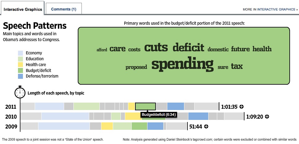
Lots of visualization love this year. But visualizations take time to create, so most of them were rooted in previously available SOTU information. The Wall Street Journal did an interactive topic and keyword breakdown of Obama’s addresses to congress since 2009, which moved about an hour after Tuesday’s speech concluded.

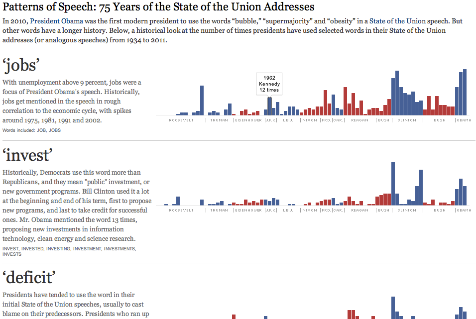
The New York Times had a snazzy graphic comparing the topics of 75 years of SOTU addresses,  by looking at the rates of certain carefully chosen words. Rollovers for individual counts, but mostly a flat thing.

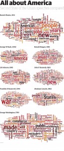
The Guardian Data Blog took a similar historical approach, with Wordles for SOTU speeches from Obama and seven other presidents back to Washington. Being the Data Blog, they also put the word frequencies for these speeches into a downloadable spreadsheet. It’s a huge image, definitely intended for big print pages.

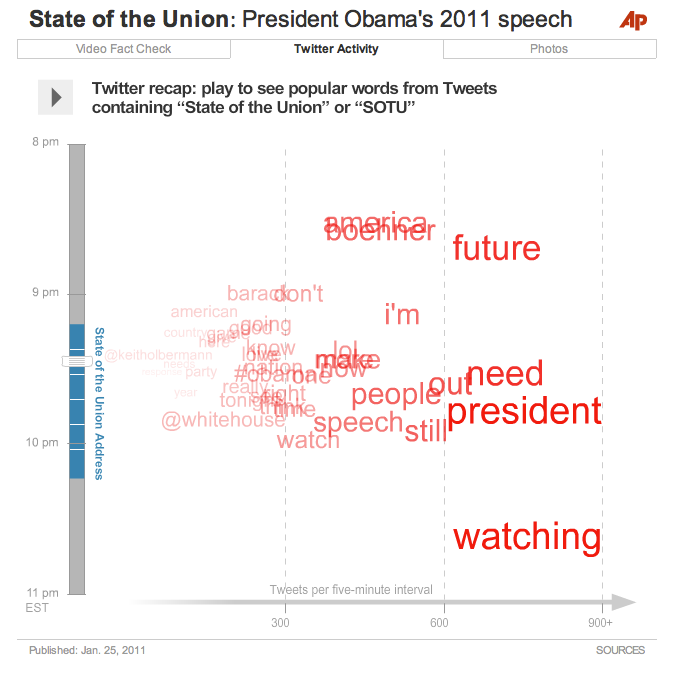
A shout-out to my AP colleagues for all their hard work on our SOTU interactive, which included the video, a fact-checked transcript, and an animated visualization of Twitter responses before, during, and after the State of the Union.

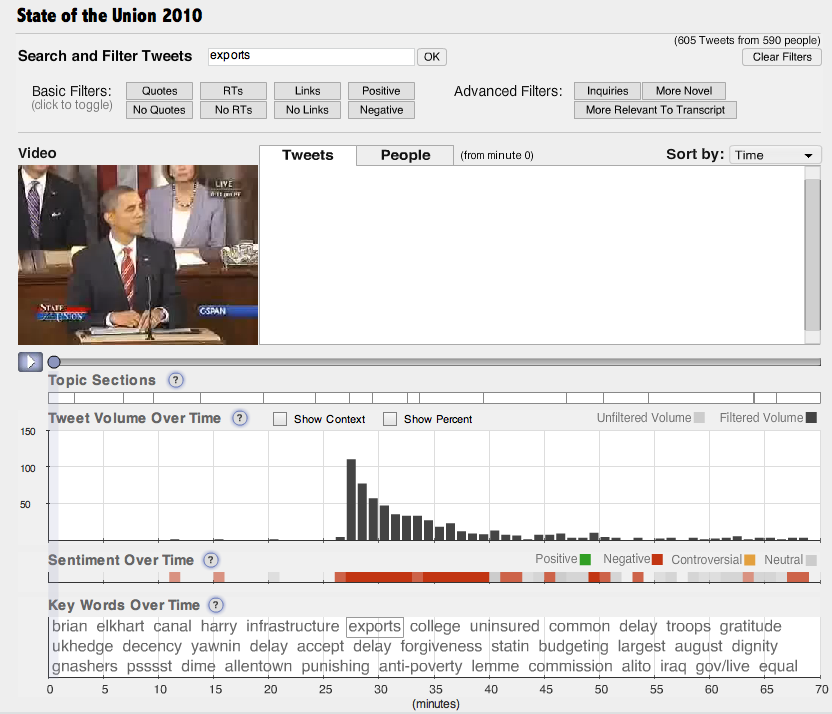
But it’s not clear what, if anything, we can actually learn from such visualizations. In terms of solid journalism content, possibly the best visualization came not from a news organization but from Nick Diakopoulos and co. at Rutgers University. Their Vox Civitas tool does filtering, search, and visualization of over  100,000 tweets captured during the address.

I find this interface a little too complex for general audience consumption — definitely a power user’s tool. But the algorithms are second to none. For example, Vox Civitas compares tweets to the text of the speech within the previous two minutes to detect “relevance,” and the automated keyword extraction — you can see the keywords at the bottom of the interface above — is based on tf-idf and seems to choose really interesting and relevant words. The interactive graph of keyword frequency over time clearly shows the sort of information that I had hoped to reveal with the AP’s visualization.

Fact Checking

A number of organizations did real-time or near real-time fact checking, as Yahoo reports. The Sunlight Foundation used itsSunlight Live system fo real-time fact checks and commentary. This platform, incorporating live video, social media monitoring, and other components is expected to be available as an open-source web app, for the use of other news organizations, by mid-2011.

The Associated Press published a long fact check piece (also integrated into the AP interactive), ABC had their own story, and CNN took a stab at it.

But the heaviest hitter was Politifact, who had a number of fact check rulings within hours and several more by Wednesday evening. These are together in a nice summary article, but as is their custom the individual fact checks are extensively documented and linked to primary sources.

Audience engagement

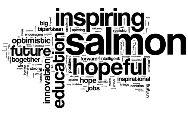
Pretty much every news organization had some SUTO action on social media, though with varying degrees of aggressiveness and creativity. Some of the more interesting efforts involved solicitation of audience responses of a specific kind. NPR asked people to describe their reaction to the state of the union in three words. This was promoted aggressively on Twitter and Facebook. They also asked for political affiliation, and split out the 4000 responses into Democratic and Republican word clouds:

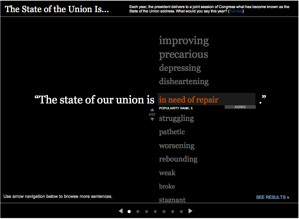
Apparently, Obama’s salmon joke went down well. The Wall Street Journal went live Tuesday morning with “The State of the Union is…” asking viewers to leave a one word answer. This was also promoted on Twitter. Their results were presented in the same interactive, as a popularity-sorted list.

Aside from this type of interactive, we saw lots of agressive social media engagement in general. The more social-media savvy organizations were all over this, promoting their upcoming coverage and responding to their audiences. As usual, the Huffington Post was pretty seriously tweeting the event, posting about updates to their live blog, etc. and going well into Wednesday morning. Perhaps inspired by NPR, they encouraged people to tweet their #3wordreaction to the speech. They also collected and highlighted reaction from teachers, Sarah Palin, etc.

But as an AP colleague of mine asked, engagement to what end? Getting people’s attention is great, but then how do we, as journalists, focus that attention in a way that makes people think or act?

The White House

No online media roundup of the SOTU would be complete without a discussion of the White House’s own efforts, including web and mobile app presences. Fortunately, Nieman Journalism Lab has done this for us. Here I’ll just add that the White House livestreamed a Q&A session in front of  an audience immediately after the speech, in which White House Office of Public Engagement’s Kal Penn (aka Kumar) read questions from social media. Then Obama himself did an intervew Thursday afternoon in which he answered questions submitted as videos on YouTube.

What is news when the audience is editor?

This is a paper I wrote in December 2009. I’ve decided to post it now, partially because it contains a previously unreported 30-day content comparison of Digg versus the New York times. Looking back on this work, I think that its greatest weakness is an under-appreciation of the importance of production processes in determining what gets reported and how. In other words, I believe now that the intense pressure of daily deadlines shapes the news far more than external influences such as political and commercial pressures — at least in countries where the press is relatively free. Also available as a pdf.

Abstract
There are now several websites which allow users to assemble news content from around the internet by means of voting systems. The result is a new kind of front page that directly reflects what the audience believes to be salient, as opposed to what the editorial staff of a newsroom believes the audience should know. Content analyses of such sites show that they have little overlap with mainstream media agendas (5% in a previous study). In fact, many of the items selected by users would not traditionally be considered “news” at all. This paper examines the shift from editor to audience agendas in the context of previous theories of news production, discusses existing content analysis work on the subject, and reports on a new 30 day study of Digg.com versus NYTimes.com.

Introduction
No news organization can cover everything. Traditionally, it is ultimately the editor of a news publication who decides what is newsworthy: what stories reporters will follow, and what stories will be published. It has been considered part of the value of a news organization to determine what its audiences need to know about.

It’s never been entirely clear how professional journalists decide which events are worth reporting, out of all the events taking place in the world. Neither has it been obvious how editorial choices relate to the audience’s personal judgments about what is important, but  such questions were largely theoretical before the advent of the web. “I own a newspaper, you do not” was always the implicit end to discussions about who got to decide what was news.

Today, publishing is near-free and the news package has been disaggregated. An online audience member can select single stories that interest them, without reading or even really being aware of the traditional news package. Alongside this disaggregation we find a new class of online applications that re-aggregate content from multiple sources. Readers vote on pages from across the web, and the top-rated items are displayed on the aggregator’s home page.

News consumers are literally tearing the world’s newspapers apart and re-assembling them to fit their own agendas, including lots of content not traditionally considered news at all.

This paper examines what we can learn about the online audience’s judgment not only of what is important but what is news at all, and how it differs from that of traditional newsrooms. I review previous work on “news values”  and “news agenda” in professional journalism, look at measurements of what audiences view online, and report on my own 30 day quantitative study of Digg as compared to the New York Times.

Features of the audience-generated agenda
Continue reading What is news when the audience is editor?

By the numbers, American journalism failed to inform voters

A recent study by World Public Opinion.org shows that the majority of the American population believed false things about basic national issues, right before the 2010 mid-term elections. I don’t know how to interpret this as anything other than a catastrophic failure of American journalism, in its most fundamental, clichéd, “inform the public” role.

The most damning section of the report (PDF) is titled “Evidence of Misinformation Among Voters.”

The poll found strong evidence that voters were substantially misinformed on many of the issues prominent in the election campaign, including the stimulus legislation, the healthcare reform law, TARP, the state of the economy, climate change, campaign contributions by the US Chamber of Commerce and President Obama’s birthplace. In particular, voters had perceptions about the expert opinion of economists and other scientists that were quite different from actual expert opinion.

This study also found that Fox viewers were significantly more misinformed than average on many issues, which is mostly how this survey was covered in the blogosphere and mainstream news outlets. I think this Fox thing is a terrible diversion from the core problem: the American press did not succeed in informing the public. Not even right before an election, not even on the narrow set of issues that, by survey, voters cared to base their votes on.

The travesty here is that the relevant facts were instantly available from primary sources, such as the Congressional Budget Office and the Intergovernmental Panel on Climate Change. I interpret this failure in the following way: for many kinds of issues, the web makes it easy to find true information. But it doesn’t solve the problem of making people go look. That, perhaps, is a key role for modern journalism. Unfortunately, modern American journalism seems to be very bad at it. I imagine the same problem exists in the journalism of many other countries.

What the study actually says
The study compares what voters think experts believe with what those experts actually believe. This is a bit tricky, and the study isn’t saying that the experts are necessarily right, but we’ll get to that. First, some example findings:

  • 68% of voters thought that “most economists” believe that the stimulus package “saved or created a few jobs” and 20% thought most economists believe that the stimulus caused job losses, whereas only 8% correctly said that most economists think it “saved or created several million jobs.” (The Congressional Budget Office estimates that the stimulus saved several millions jobs, as do 75% of economists interviewed by the Wall Street Journal.)
  • 53% of voters thought that economists believe that Obama’s health care reform plan will increase the deficit, while 29% said that economists were evenly divided on this issue. Only 13% said correctly that a majority of economists think that health care reform will not increase the deficit. (The Congressional Budget Office estimates a net reduction in deficits of $143 billion over 2010-2019, and Boards of Trustees of the Medicare Fund also believe that the Affordable Care act will “postpone the exhaustion of … trust fund assets.”)
  • 12% of voters thought that “most scientists believe” that climate change is not occurring, while 33% thought scientists were evenly divided on the issue. That’s 45% with an incorrect perception, as opposed to the 54% who said, correctly, that most scientists think climate change is occurring. (Aside from the IPCC reports and virtually every governmental study of the issue worldwide, an April 2010 survey of climate scientists showed that 97% believe that human-caused climate change is occurring.)

A fussy but necessary digression: all of this rests on the reliability of the WorldPublicOpinion.org survey results. The survey was conducted by Knowledge Networks, Inc. using an online response panel randomly selected from the US population. Those without internet access were apparently provided it for free. I have been unable to find any serious independent evaluation of Knowledge Networks’ methodology, but their many research papers on sample design certainly talk the talk. All of the basic sampling errors, such as self-selection and language bias (what about Hispanics?) are at least addressed on paper. The margin of error is reported as 3.9%.

So let’s take these survey results as accurate, for the moment. This means that the majority of the American public had an incorrect conception of expert opinion on the issues that they voted on. That’s a mouthful. It’s not the same as “believed false things,” and in fact asking “what do you think experts believe” deliberately dodges the tricky question of what is true. If there is some misperception of expert belief, then in the strictest terms the public is misinformed. The study addresses this point as follows:

In most cases we inquired about respondents’ views of expert opinion, as well as the respondents’ own views. While one may argue that a respondent who had a belief that is at odds with expert opinion is misinformed, in designing this study we took the position that some respondents may have had correct information about prevailing expert opinion but nonetheless came to a contrary conclusion, and thus should not be regarded as ‘misinformed.’

So this study does not say “the American public are wrong about the economy and climate change.” It says that they haven’t really looked into it. I’m all for questioning authority’s claim to truth — anyone who follows my work knows that I’m generally a fan of Wikipedia, for example — but I believe we must take lifelong study and rigorous methodology seriously. To put it another way: voting contrary to the opinions of economists may be a fine thing, but voting without any awareness of their work is just silly. Yet that seems to be exactly what happened in the last election.

The role of the press, then and now
Of course, voting is hard and stuff is complex, which is why we rely on the media to break it all down for us. The sad part is that economics and climate change are familiar ground for journalists. It’s not like the facts of these issues were not published in mainstream news outlets. For that matter, journalists were not even necessary here. Any citizen with a web browser could have found out exactly what the Affordable Care Act was predicted to do to the deficit. The Congressional Budget Office published their report and then blogged about it in plain language.

Maybe publishing the truth was never enough. Maybe journalism never actually “informed the public,” but merely created conditions where the curious could get themselves informed by diligently reading the news. But on big issues like whether a piece of national legislation will affect the deficit, we no longer need professionals to enable this kind of self-motivated discovery. The sources go direct in such cases, as the Congressional Budget Office did. And do we really expect that the social media sphere — that’s all of us — will remain silent about the next big global warming study? We’re all going to use Facebook etc. to share links to the next IPCC report when it comes out.

If the problem of having access to true information about these sorts of “votable issues” is solved by the web, what isn’t solved by the web is getting every voter to go look at least once. That might be a job for informed professionals at the helm of big media channels. This is a big responsibility for a news organization to try to take, but I don’t see how it’s anything but the corollary to the responsibility to only publish true information. Presumably some of that information is important enough to know, so consumers would probably appreciate the idea that your mission is to ensure they are informed.

I suspect that paper-based habits are holding journalism back here. There is a deeply ingrained newsroom emphasis on reporting only what’s “new.” A budget report only gets to be news once, even if what it says is relevant for years. But there are no “editions” online; the same headline can float on the hot topics list for as long as it’s relevant. There is even more reason to keep directing attention to an issue if people are actively discussing it, if it is greatly polarized, or if there’s a lot of spin around it (see: the rise of fact-check journalism). In any case, journalists have long been good at keeping an issue in the news, by advancing the story daily in one way or another. But first they have to know what the public doesn’t know.

So the burning question that the World Public Opinion study leaves me with is just this: why wasn’t it a news organization that commissioned this survey?

See also: Does journalism work?

Does journalism work?

How do we know that the work that journalists do accomplishes anything at all? And what does journalism do, exactly, beyond vague statements like “supports democracy” and trivial ones like “gives me movie reviews”?

I made this image a couple months ago to introduce the question at a conference. A reporter researches and writes a story. The first arrow represents the process that gets that story published. We understand that process quite well, and the internet makes publishing really cheap and easy. Then there’s a process that takes published, accurate information and turns it into truth and justice for all. That’s the part that’s fuzzy. In fact I don’t think we understand it at all. I call this “the last mile problem” in journalism — how does journalism actually reach people?

Journalists occasionally claim a scalp, such as by embarrassing a politician enough to force them to resign, or focussing attention on some issue long enough to get legislation passed. Journalism also theoretically informs citizens so they can vote responsibly, in the elections which happen every few years. As I’ve argued before, these are weak levers by which to shift society. I’m less interested in what journalism does in extraordinary times, and more interested in how the journalist’s work improves the day-to-day operation of a society, and the experiences of the people living in it.

It’s possible that much of the journalism we have is effective. Maybe the mere existence of consistent reporting on the machinations of the powerful keeps them in line, and we’ll only know what journalism really gave us when it disappears and civilization collapses into a mire of secrecy and corruption. Or maybe that’s already happened. How would we know? How can we tell whether journalism, as a local or a global endeavor, is doing better this year than last?

Other fields have goals
I like to hang around the international development community, and those people have real problems. People working in public health are charged with improving access to clean water or preventing the spread of HIV. Others try to get more girls into school, or to raise entire communities out of poverty.

There are lots of ways to attack such complex social problems. An NGO or a foundation or a UN organ could lobby local politicians, produce research reports, provide services directly to affected populations, or launch a public awareness campaign. The way in which an organization proposes to have an effect is called their “theory of change.” This is a term I hear frequently at gatherings of development workers, and from the staff of NGOs and international organizations. Such organizations must continually develop and articulate their theory of change in order to secure philanthropic funding.

Journalism has no theory of change — at least not at the level of practice.

I’ve taken to asking editors, “what do you want your work to change in society?” The answer is generally along the lines of, “we aren’t here to change things. We are only here to publish information.” I don’t think that’s an acceptable answer. Journalism without effect does not deserve the special place in democracy that it tries to claim.

The question of “what change should journalism produce” is hard because it is unavoidably a normative question, a question about how journalists envision a “better” world. At the moment, the field of professional journalism is mired in intense confusion about its role and the meaning of classic standards such as “objectivity.” This has obscured discussion of the field’s goals at a moment of great transition brought on by new communications technology, precisely the time when clarity is most needed.

It’s telling that discussions of journalism’s fundamentals frequently harken back to the great debate of Lippman vs. Dewey. That happened in the 1920s. This was not only before live television and before the internet, it was before bastions of modern reasoning such as statistical inference, the study of cognitive biases, and the social construction of knowledge were fully developed. Other fields have done much better in adapting to the philosophical and technological revolutions of the last century.

Medicine in general and public health in particular have become relentlessly evidence-based. It’s no longer enough to run anti-smoking ads; we now require those responsible for public health to show that their preferred method of behavior modification actually reduces disease. Meanwhile, marketers have rallied around the idea that purpose of their work is to get targeted individuals to do something, whether that’s purchasing a product or voting for a particular candidate. That may not be an appropriate goal for non-advocacy journalism, but marketing and public relations researchers have made very careful studies of communication, recall, and belief.

Similar concerns over how messages are received arise in many fields, from crisis communications to public diplomacy. But not in journalism. If journalism does not change action it must change minds, but the tools and language of belief change seem to be entirely missing from the profession.

Journalism as surveillance of ignorance
It used to be the job of an editor to decide what to publish. Maybe it is now the job of an editor to decide what needs to be known. These are not at all the same thing. They used to be, when nothing could be done with a story after the ink hit paper. The internet allows so much more — promotion within specific communities, feedback on readership and reception, conversation as opposed to oratory. And potentially, cheap techniques to determine what people already believe.

We should expect that users will largely be choosing for themselves what to read and view. That’s reality, and that’s fine, and systems that make it easy to satisfy curiosity are systems that will make us smarter (even though we’ll mostly use them for entertainment.) But I believe there will still be an identifiable set of common content, the few things that the public — or some targeted fraction of it — absolutely has to know to participate meaningfully in the civic issues of the day. This is more or less what editors put on the front page today. But rather than the headlines reflecting the most important events, perhaps they should reflect the most pernicious misconceptions. Good journalists already have some sense of this, and every so often we learn of an alarming gap in public knowledge. A majority of Americans believed for years that Saddam Hussein was linked to 9/11, for example. Today, most Americans don’t know what’s actually in Obama’s new health care laws. (I apologize again to my international readers for the US-centric examples; I’d love to hear of similarly woeful tales from other countries.)

Combatting ignorance is harder than publishing. It’s my best guess for the second, mysterious arrow in the diagram above. Fortunately we also have new tools. We have reams and reams of data that people voluntarily put online, the “data exhaust” of entire societies. We also have old-fashioned public opinion polls, and their lightweight cousin online polls (though self-selection bias may render online surveys useless for all but the most casual work.) Somewhere in all this data and all this communication, it must be possible to figure out what it is that people actually believe — and where those beliefs are factually wrong in an uncomplicated way, precisely the way that an editor would say “that’s not true, we can’t print it.”

There are many possibilities for understanding the beliefs of an audience. I am particularly intrigued by opinion mapping, deliberative polling, and the attempts of UN Global Pulse to create data-driven societal monitoring systems. It may actually be possible to cheaply measure the state of public knowledge, which would also give us concrete metrics for improvement. We need new ways of thinking about the surveillance of ignorance, and we need software to implement them. But more than anything else, we need journalists attuned to what it is that people don’t know. Good journalists already are; they can see what is missing from discussion — whether that’s a question that no one has answered or a challenge to a prevalent belief — and do the hard work of adding it.

This effort applies at all scales. Each journalist has an audience or audiences, their communities of concern. Each could track what their audience already knows and believes. The job of the journalist, so conceived, is not merely to report the happenings, but to ensure that the audience is aware of and understands the most crucial of them. That won’t be easy. Aside from the challenges of determining what an audience already knows, people don’t like to be told they’re uninformed or wrong. This is why I believe a journalist needs to learn everything there is know about public communication, borrowing and adapting from marketing experts and public health planners. Genuine honesty and humility seems to me the ethical core, and newsroom transparency is a critical check on this power.

Of course, decisions would have to be made about what are misconceptions and which of them are important enough to combat. Decisions have to be made already about what to cover and promote with limited resources, and these hard choices are the iceberg that sinks any hope of a truly “impartial” journalism. It’s a reality that the profession has to deal with every day, and I wish we would get on with the work of crafting and communicating our normative stance, rather than insisting that “objectivity” means we don’t have one. (Even Wikipedia explains its norms in great detail.) I’d like to start with a list of things that journalists wish were better known. Be honest. I know you’ve already thought about this.

But if we can get over that hurdle — if we can admit that journalism needs concrete goals — then we stand a chance of doing better journalism, and knowing when we’re doing it. For me, the insane possibility of new communications technology carries with it the obligation to do better than we ever have before.

UPDATE: As if on cue, a major study was released four days after I published this, showing that a majority of American voters were misinformed about the issues they voted on in the recent mid-term elections. I discuss what that means here.
A full-text visualization of the Iraq War Logs

Update (Apr 2012): the exploratory work described in this post has since blossomed into the Overview Project, an open-source large document set visualization tool for investigative journalists and other curious people, and we’ve now completed several stories with this technique. If you’d like to apply this type of visualization to your own documents, give Overview a try!

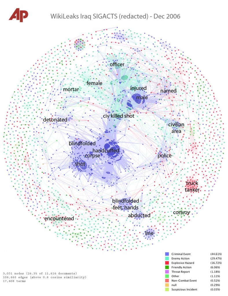
Last month, my colleague Julian Burgess and I took a shot a peering into the Iraq War Logs by visualizing them in bulk, as opposed to using keyword searches in an attempt to figure out which of the 391,832 SIGACT reports we should be reading. Other people have created visualizations of this unique document set, such as plots of the incident locations on a map of Iraq, and graphs of monthly casualties. We wanted to go a step further, by designing a visualization based on the the richest part of each report: the free text summary, where a real human describes what happened, in jargon-inflected English.

Also, we wanted to investigate more general visualization techniques. At the Associated Press we get huge document dumps on a weekly or sometimes daily basis. It’s not unusual to get 10,000 pages from a FOIA request — emails, court records, meeting minutes, and many other types of documents, most of which don’t have latitude and longitude that can be plotted on a map. And all of us are increasingly flooded by large document sets released under government transparency initiatives. Such huge files are far too large to read, so they’re only as useful as our tools to access them. But how do you visualize a random bunch of documents?

We’ve found at least one technique that yields interesting results, a graph visualization where each document is node, and edges between them are weighted using cosine-similarity on TF-IDF vectors. I’ll explain exactly what that is and how to interpret it in a moment. But first, the journalism. We learned some things about the Iraq war. That’s one sense in which our experiment was a success; the other valuable lesson is that there are a boatload of research-grade visual analytics techniques just waiting to be applied to journalism.

click for super hi-res version

Interpreting the Iraq War, December 2006
This is a picture of the 11,616 SIGACT (“significant action”) reports from December 2006, the bloodiest month of the war. Each report is a dot. Each dot is labelled by the three most “characteristic” words in that report. Documents that are “similar” have edges drawn between them. The location of the dot is abstract, and has nothing to do with geography. Instead, dots with edges between them are pulled closer together. This produces a series of clusters, which are labelled by the words that are most “characteristic” of the reports in that cluster. I’ll explain precisely what “similar” and “characteristic” mean later, but that’s the intuition.

Continue reading A full-text visualization of the Iraq War Logs

Overview: a tool for exploring large document sets

This Associated Press, my employer, has submitted the following proposal to the Knight News Challenge, reproduced here because the original on Knight’s site eats the paragraph breaks and doesn’t display the full-res image.

click for larger image, or awesome hi-res version

Describe your project:
Overview will be a tool for finding stories in large document sets, stories that might otherwise be missed. We will use the AP’s newsroom as a real-world environment to design and build a system to help journalists clean, visualize, and explore very large document sets — tens or hundreds of thousands of pages. We want to build a tool to answer the question, “what’s in there?”

Continue reading Overview: a tool for exploring large document sets

ClimateRapidResponse.org aims to connect journalists to real climate scientists, on deadline

From climaterapidresponse.org:

We have assembled a group of leading scientists to improve communication on the issue of climate change. Our group is committed to providing rapid, high-quality information to media and government. Our members have expertise in virtually all areas of climate science and they are available to share their current understanding. Questions and requests can be submitted below.

Sounds great to me, but I was curious as to who was behind the project, and who these “scientists” I might talk to actually are. I submitted this query with their form, and got the following email back 20 minutes later. (Dr. Weymann kindly gave me permission to publish it; the added links are mine)

Continue reading ClimateRapidResponse.org aims to connect journalists to real climate scientists, on deadline